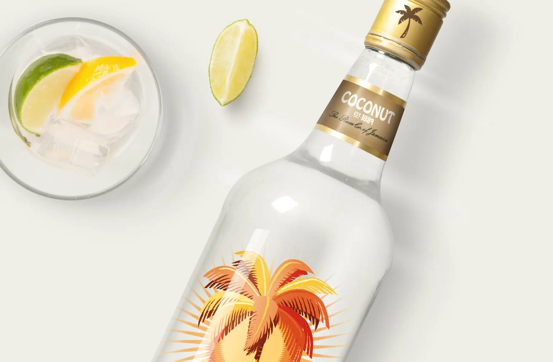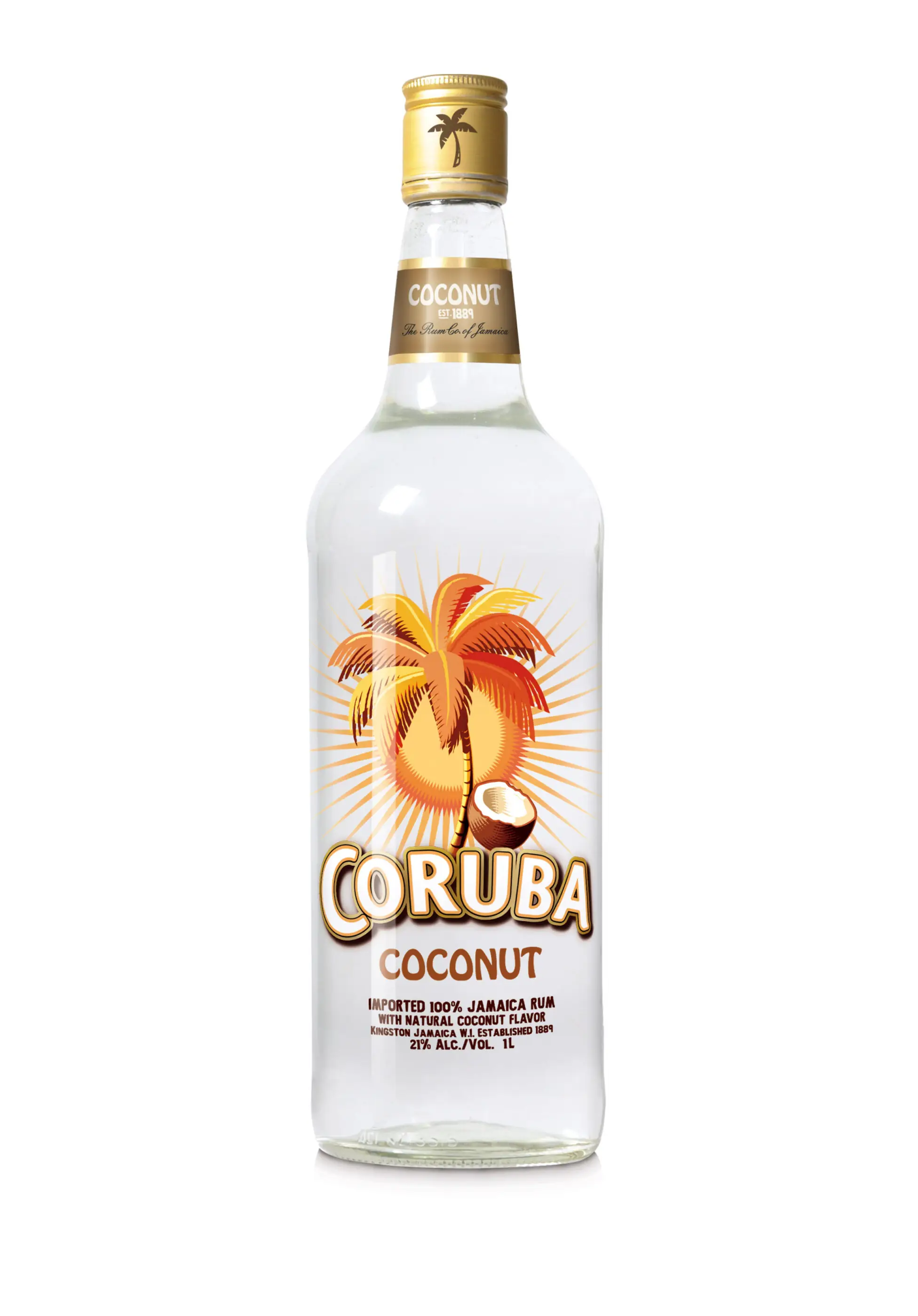
Unchanged for 10 years, Coruba was a drink that needed refreshing. The sun was setting on the previously iconic tipple, as other spirits like vodka started looking a bit sexier. The bottle looked dated and the design more ‘80’s pirate’ than modern St Barth’s. Coruba was in danger of going the way of the wine cooler. Looking closely at shelves, and in customers’ lives led our direction – get more style and attitude into the bottle shape (smooth, curvier), and then the identity would have a lot going for it. Its hints at paradise had the potential to light up a party or create a warm glow for tropical-style, sunset chillaxing. The answer lay in giving the bottle a bit of swagger again. A top to bottom makeover and a totally refreshed attitude. The result was truer to the spirit of the modern Caribbean …and proof that style, and branding, is all about attitude and good bones.

