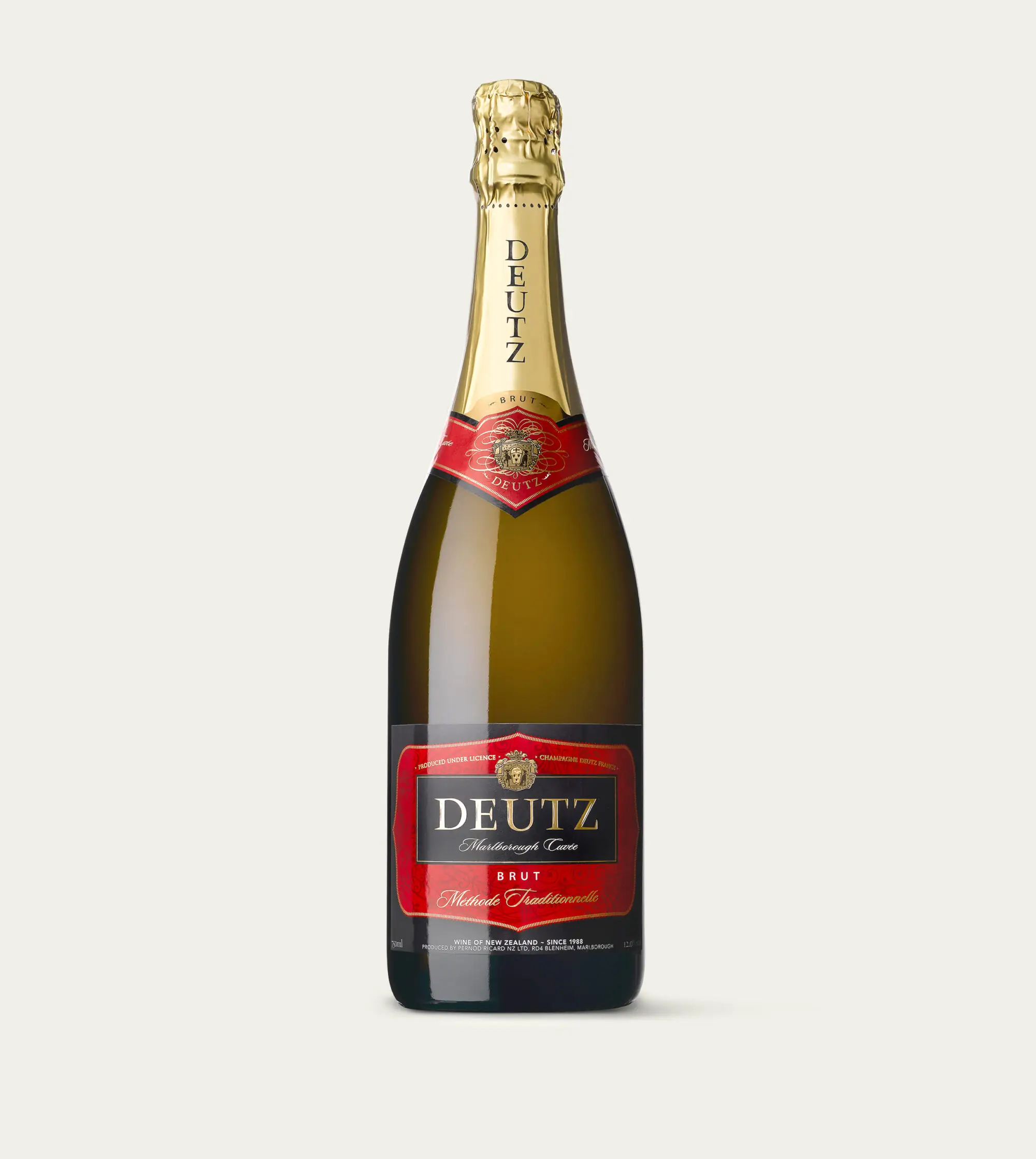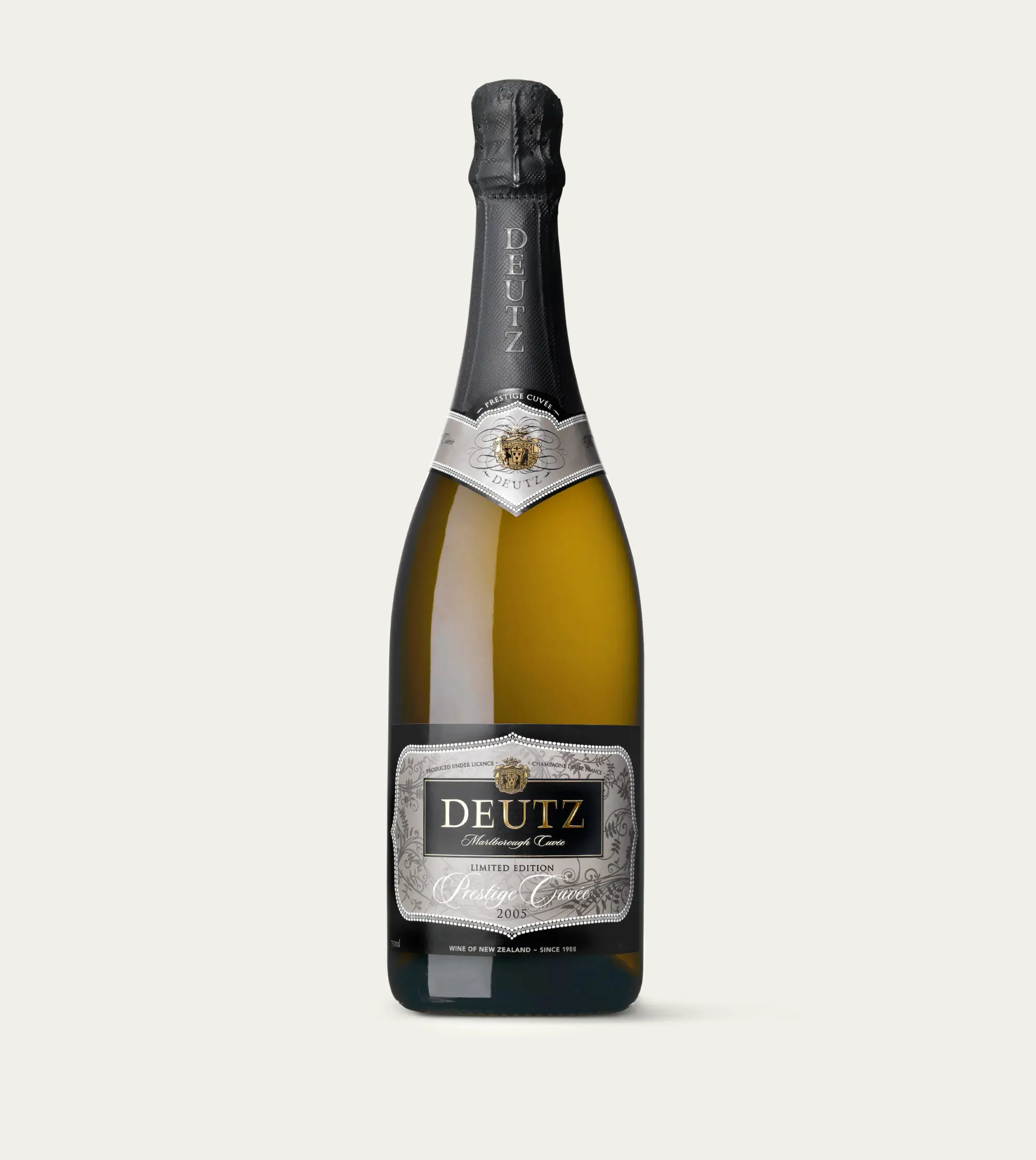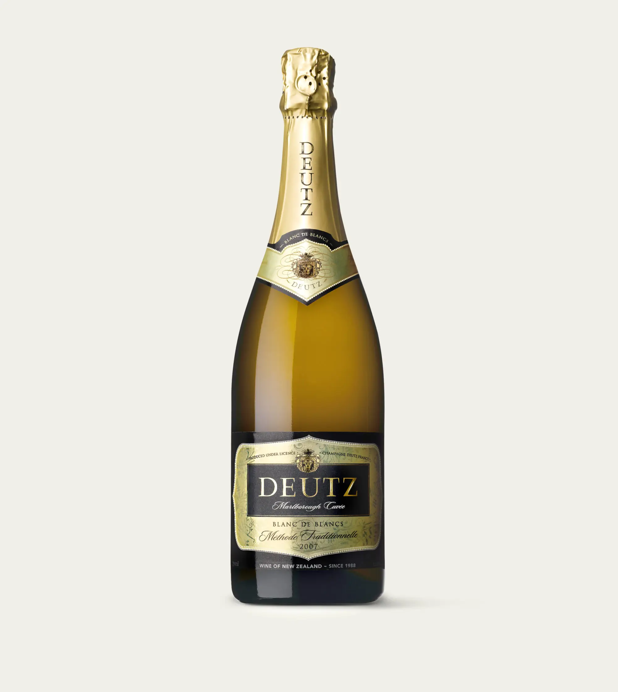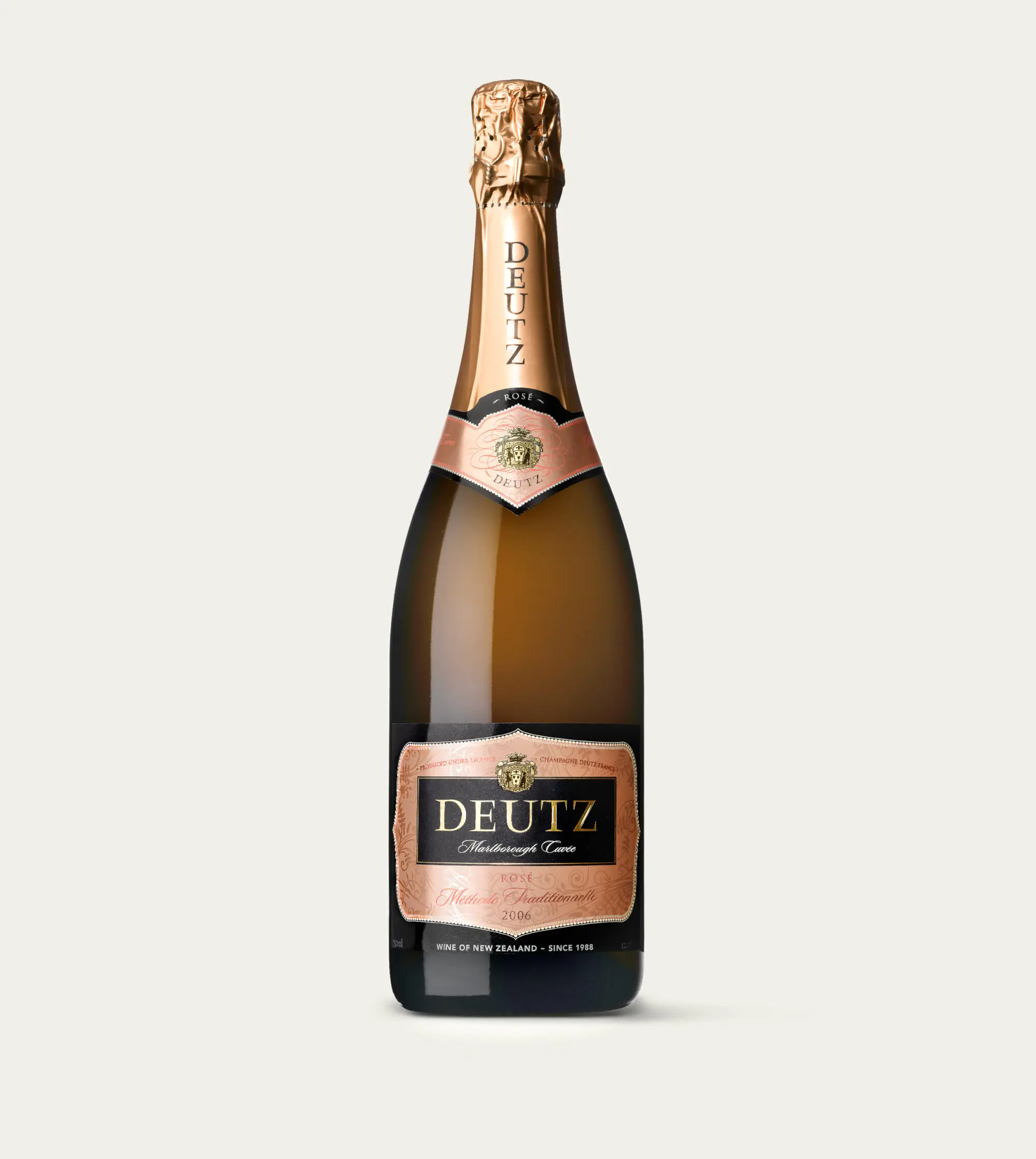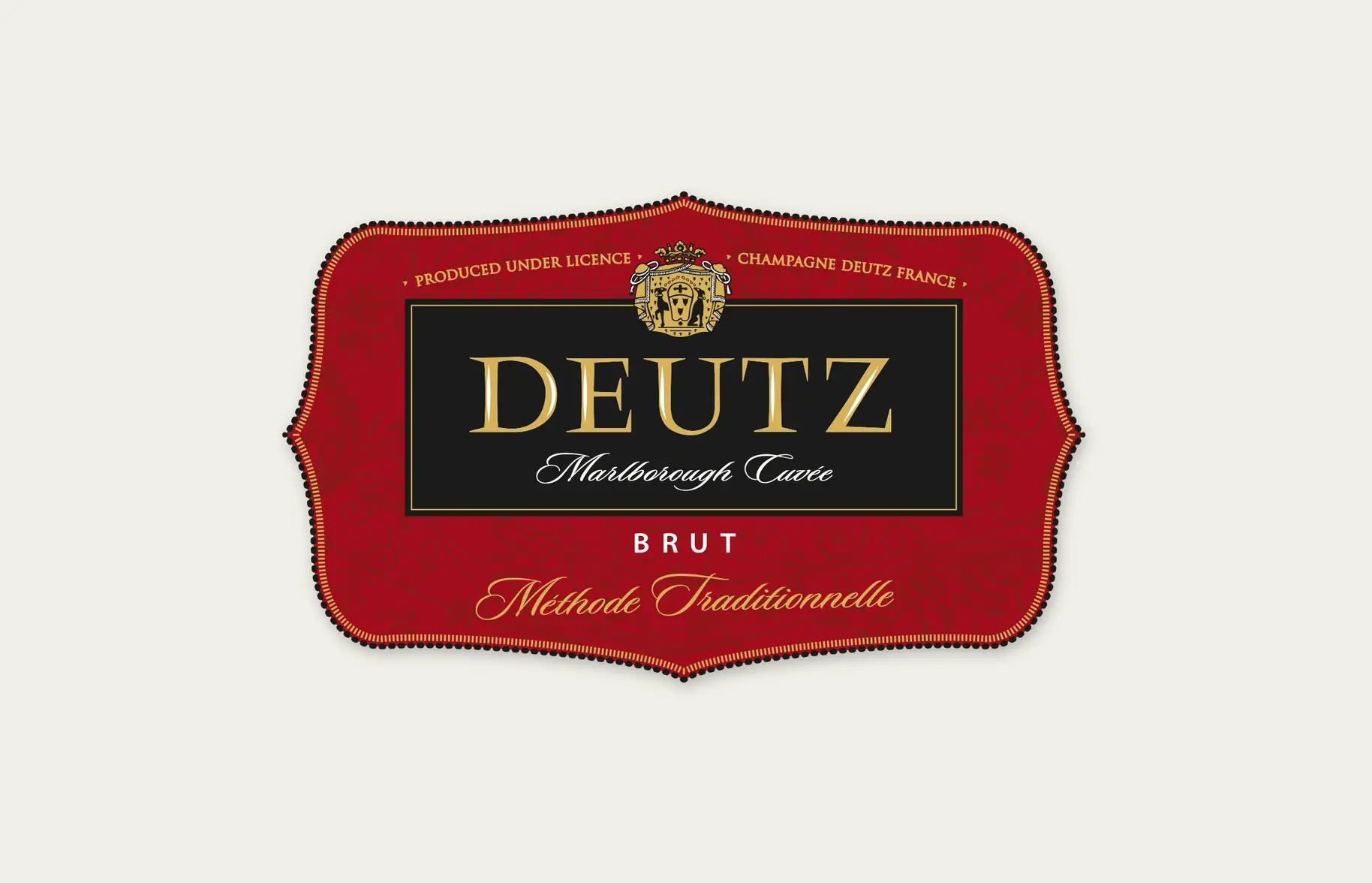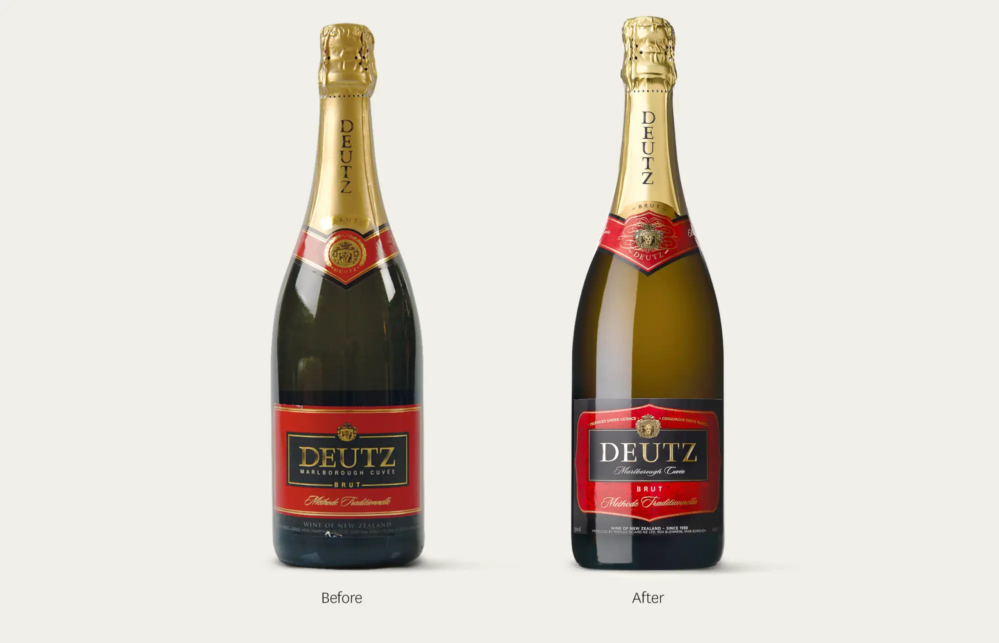
In an increasingly crowded market, Deutz was feeling a bit flat. It needed to get its sparkle back. The twist was that it had a loyal following, so it couldn't be a revolution. So how do you change, but stay the same? By accentuating the positive and not messing with mister in-between. And there was plenty positive about Deutz to play with. Part of the Louis Roederer portfolio, Deutz in New Zealand was the only international winemaker partnered to use both the name and the same viticulture process as its French namesake. So latching onto the French connection - new scripted font, intricate decorative illustrations, extra print finishes and embossing, were all added. Not quite Hall of Mirrors at Versaille, but nonetheless still true to its authentic French credentials. And all finished with a control and an eye for the right-balance that Louis XIV didn’t quite grasp (there’s embellishment and then there’s just plain bling). So for Deutz it was a revolution masquerading as an evolution, bringing all the loyal subjects along with it (and some new ones), and that’s a real art in itself.
