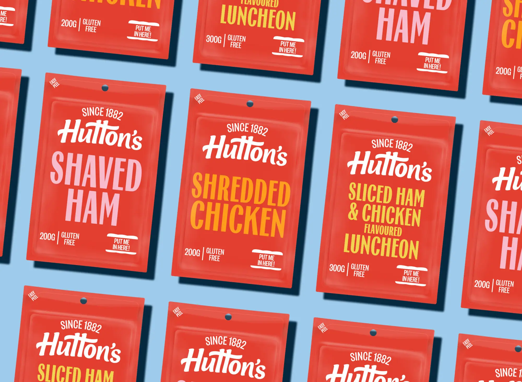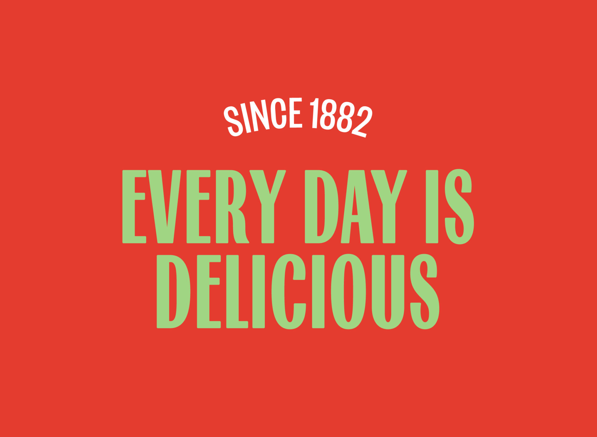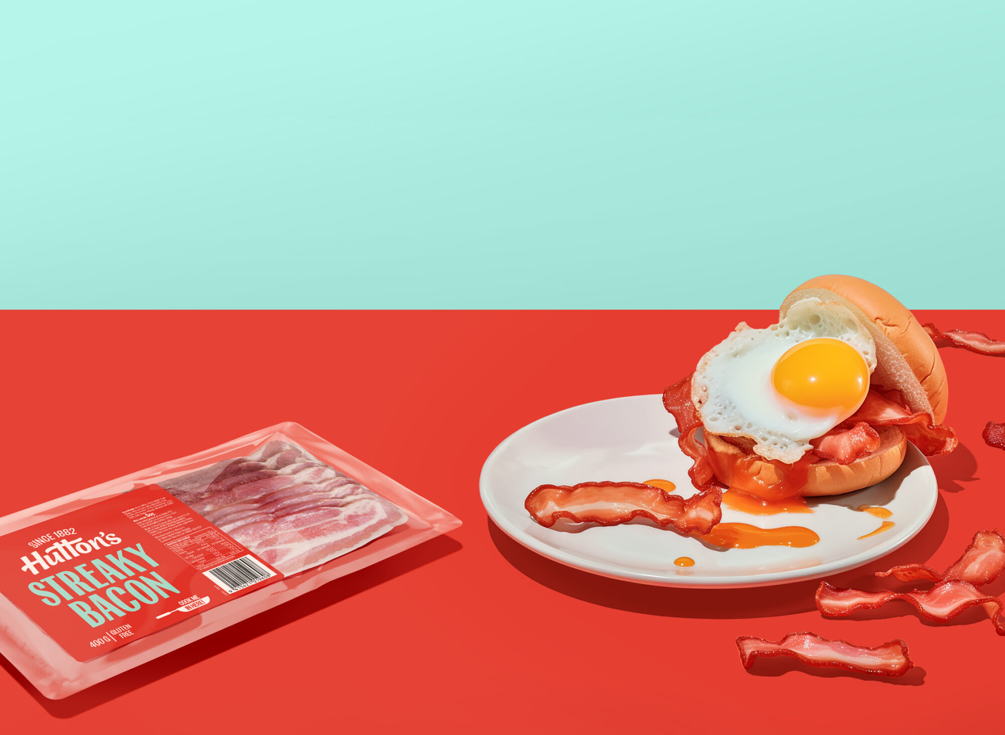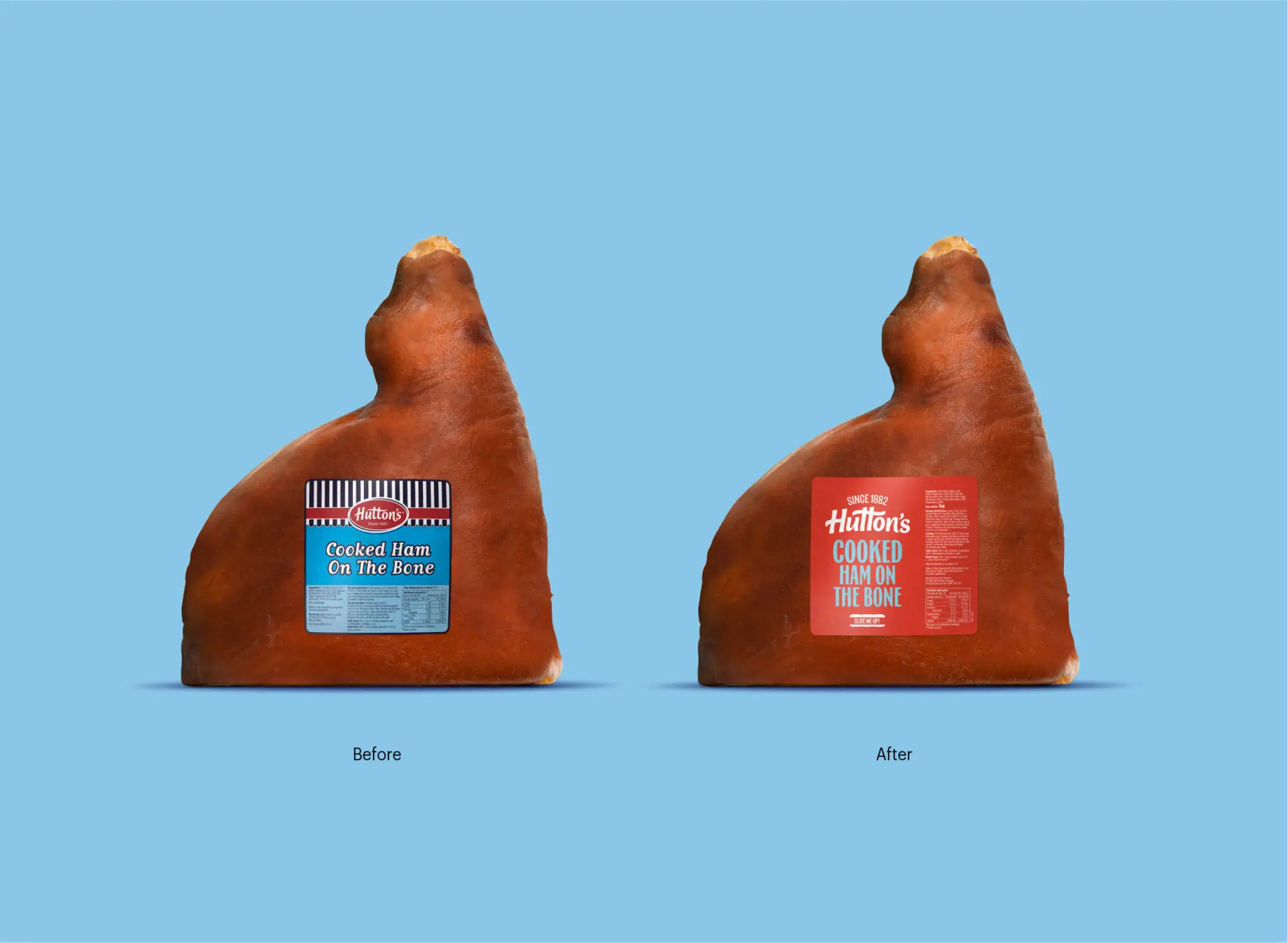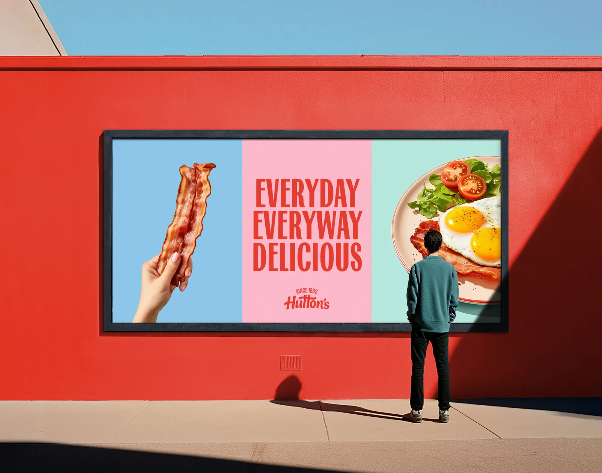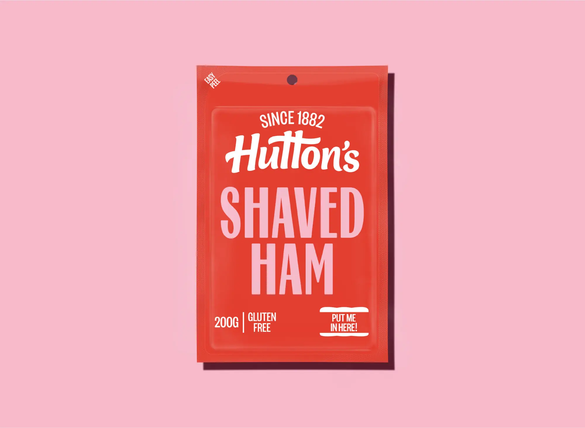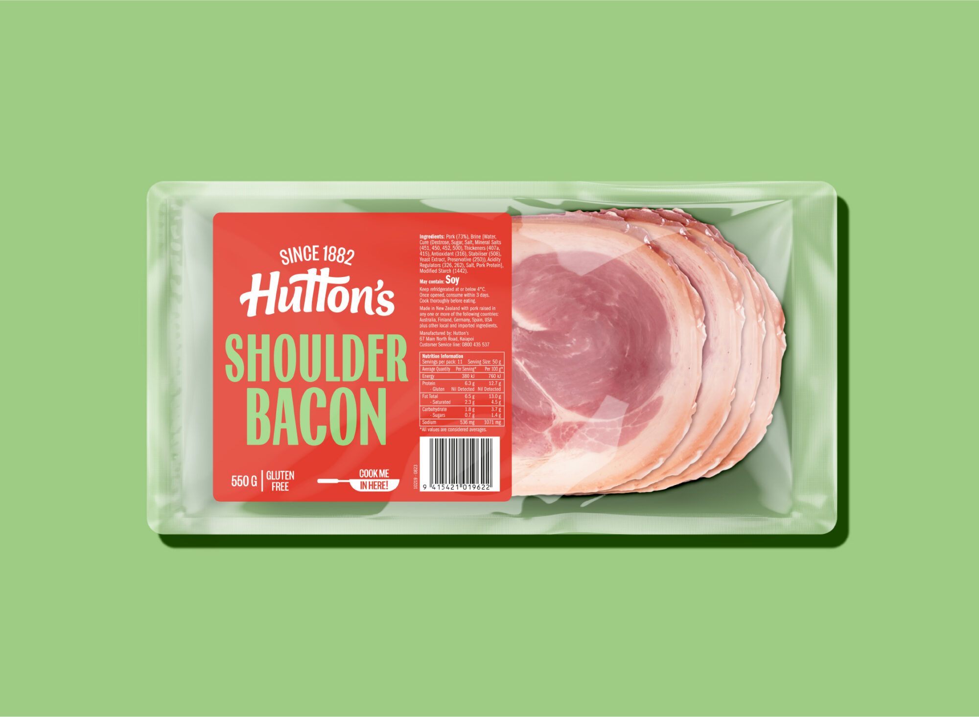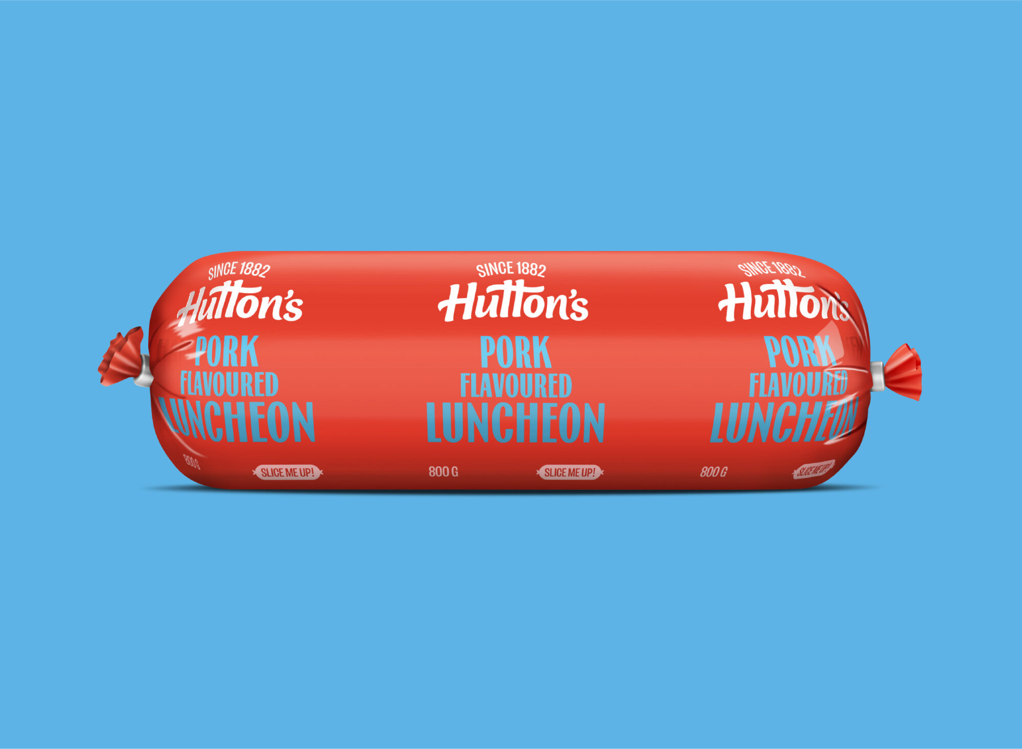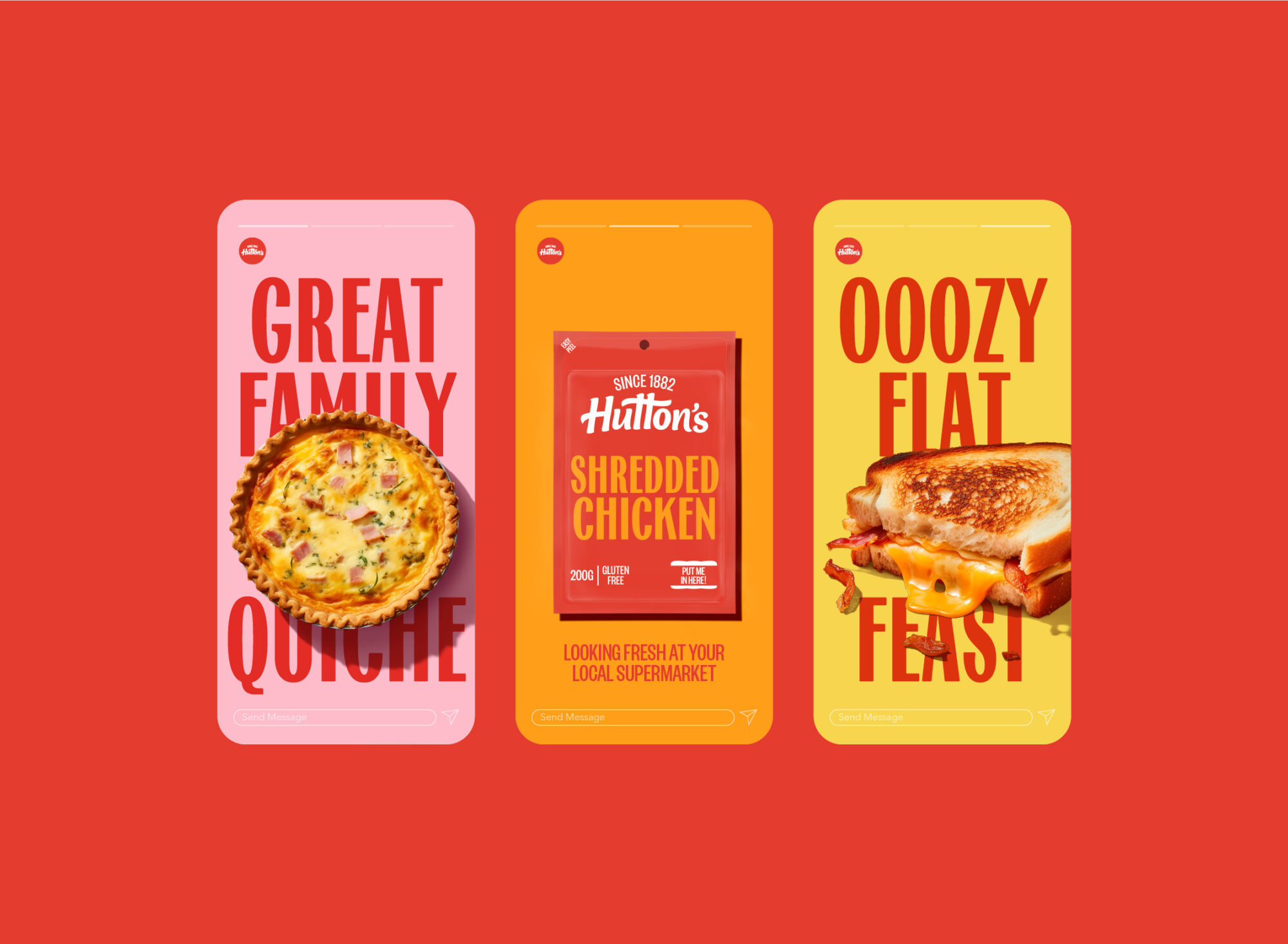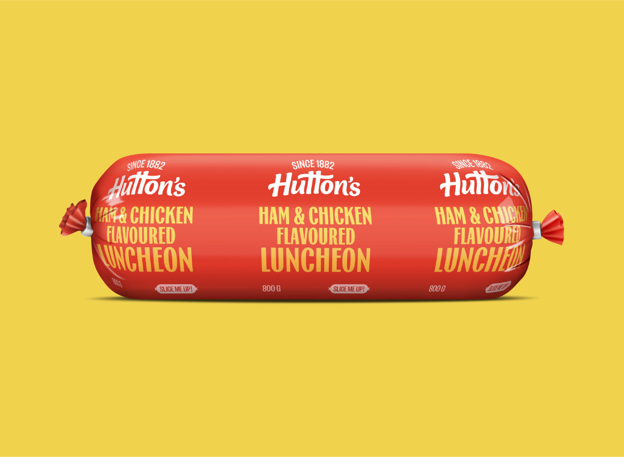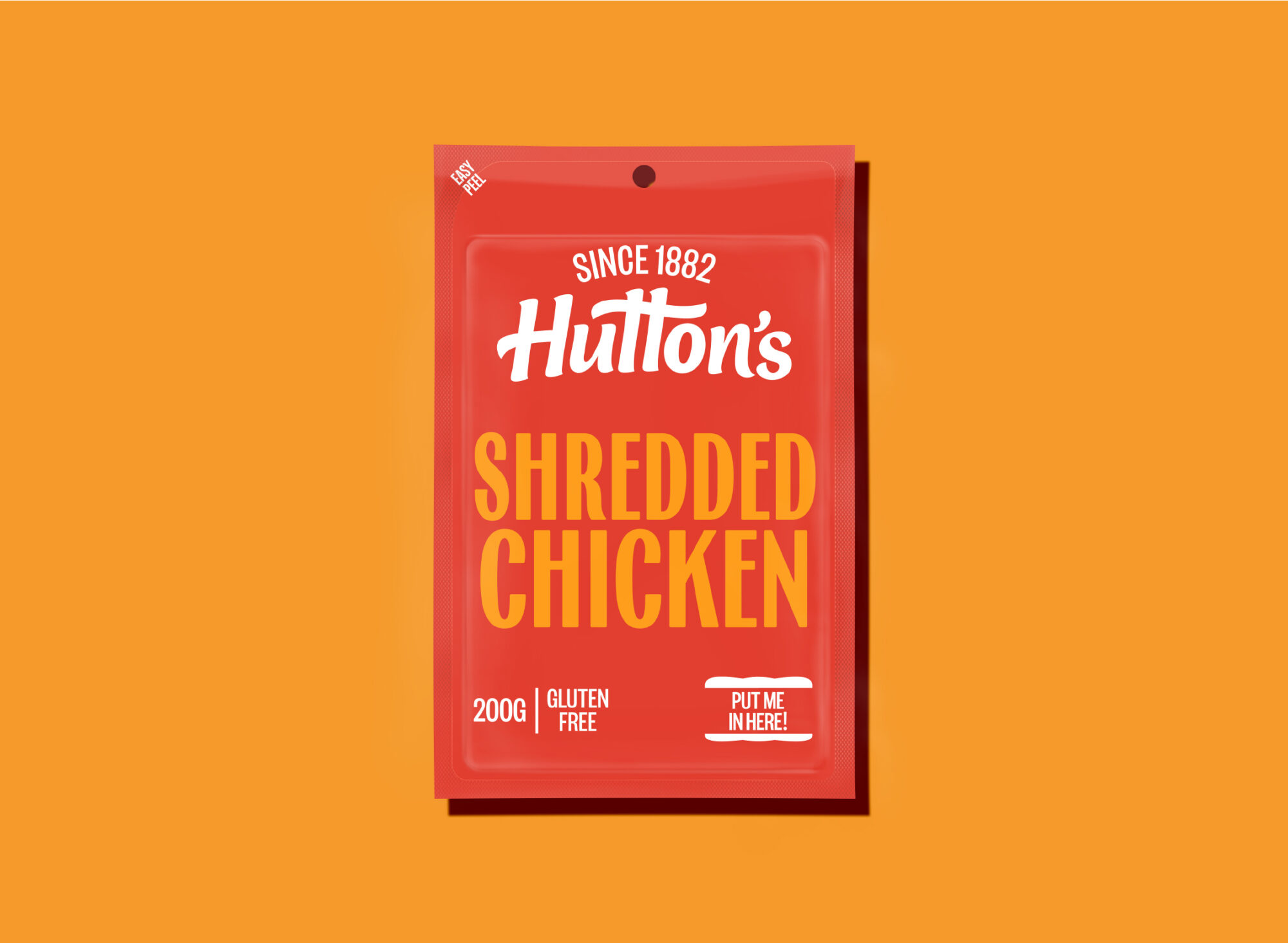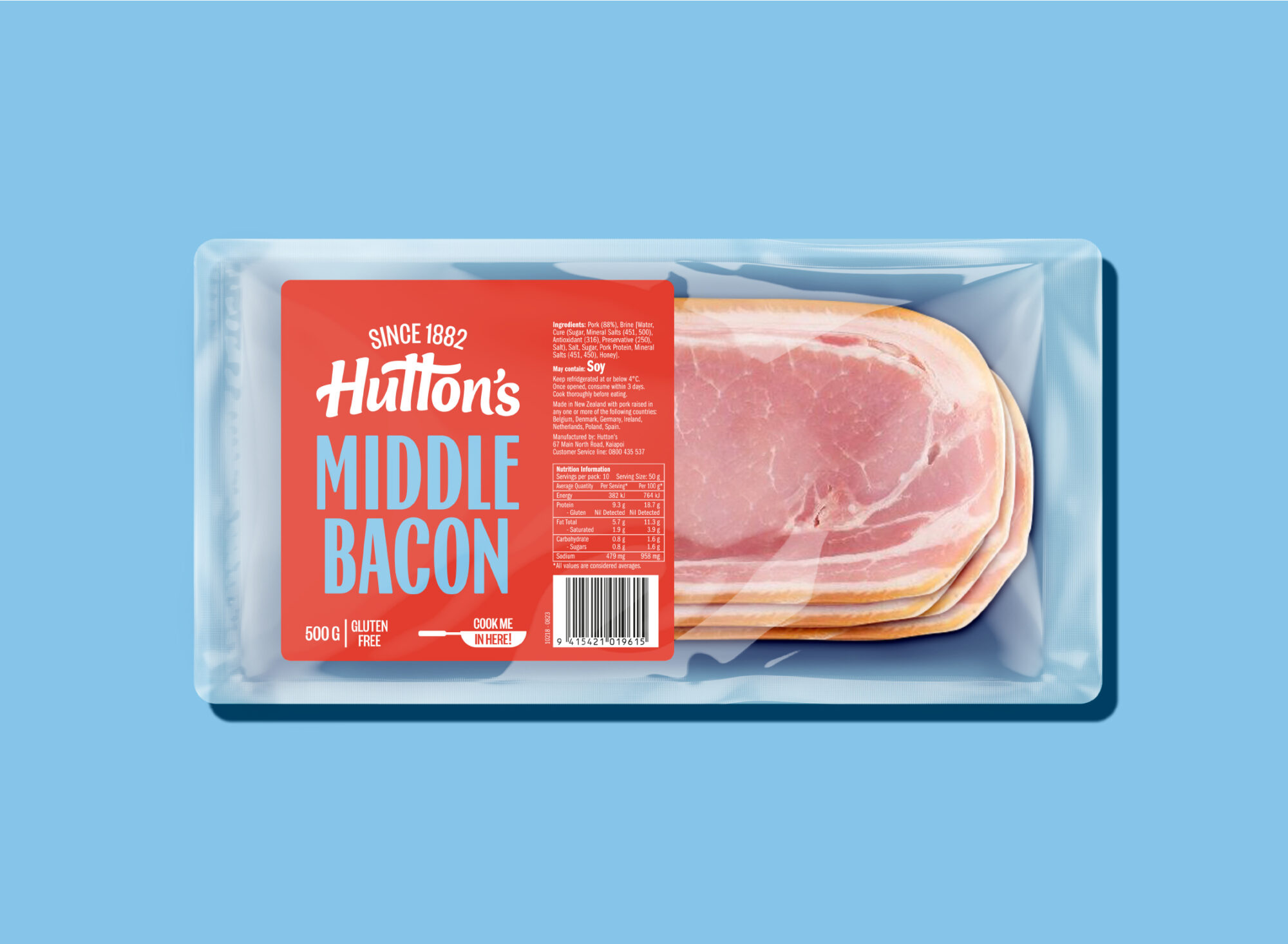
It’s not often that you get to work on a one hundred and forty year old brand. As we dove into the Hutton’s archive we were all struck by how daring the brand had been in its past - full of cute claims and surprising images, the archive had everyone dazzled. With our inspiration set, our revived branding resets the traditional Hutton’s red with more of its historical sass, and our colour palette doubles down on the drawing power. We’re also restarting Hutton’s old, more conversational tone, which we think will resonate with today’s budget-watchers, whether you’re a flattie, a family or one of the older folks. It’s easy everyday stuff but the brand is now wearing its creds on it sleeve with a new crafted logo, and a product font with just the right amount of surprise to it. It’s bright, it’s inspiring, and it’s useful. Dazzling us still, today.

