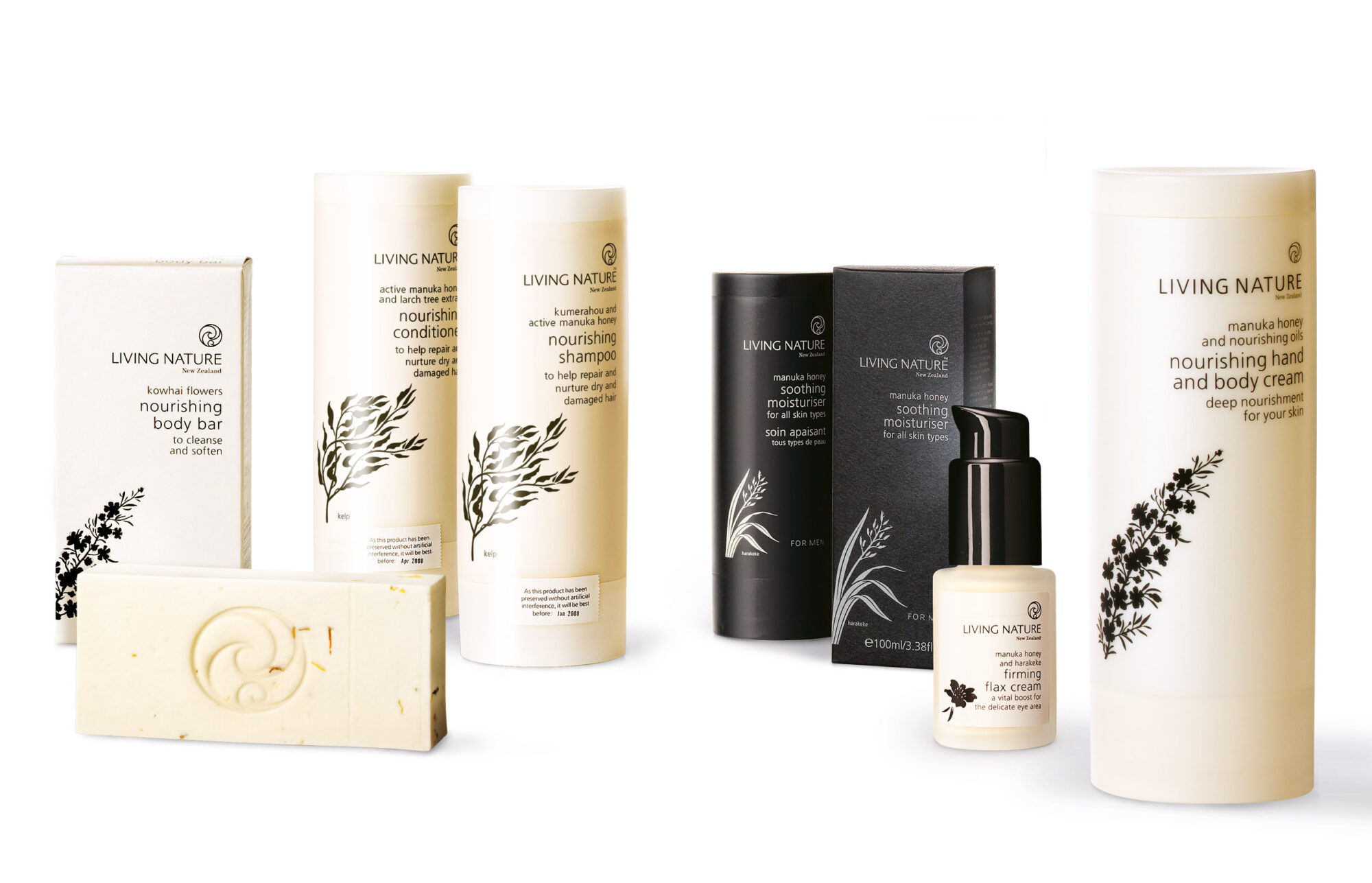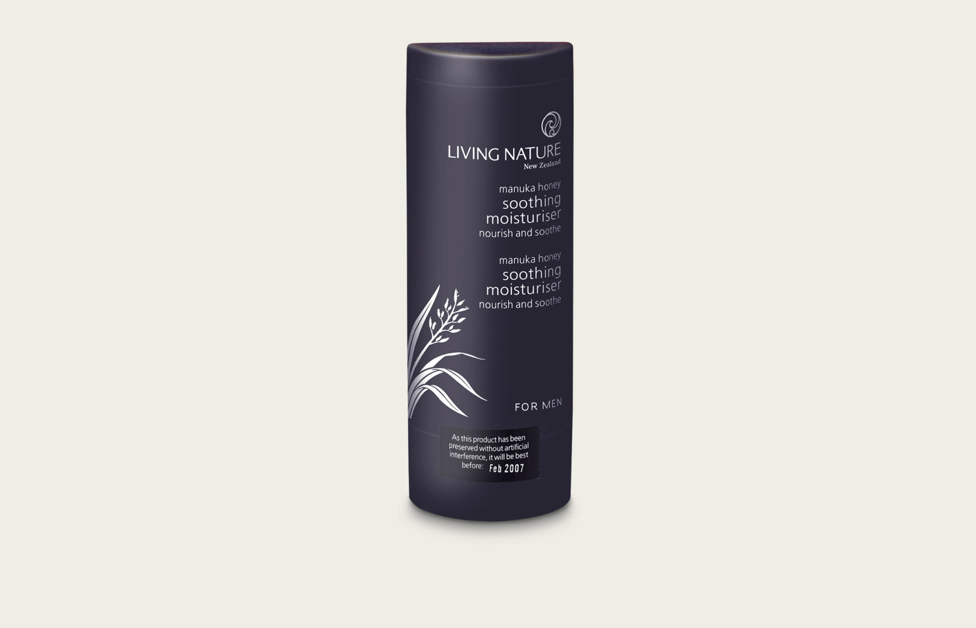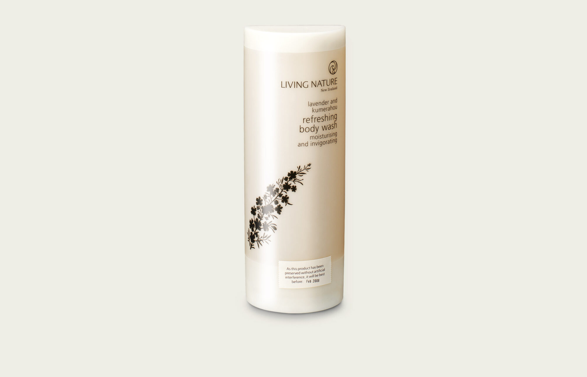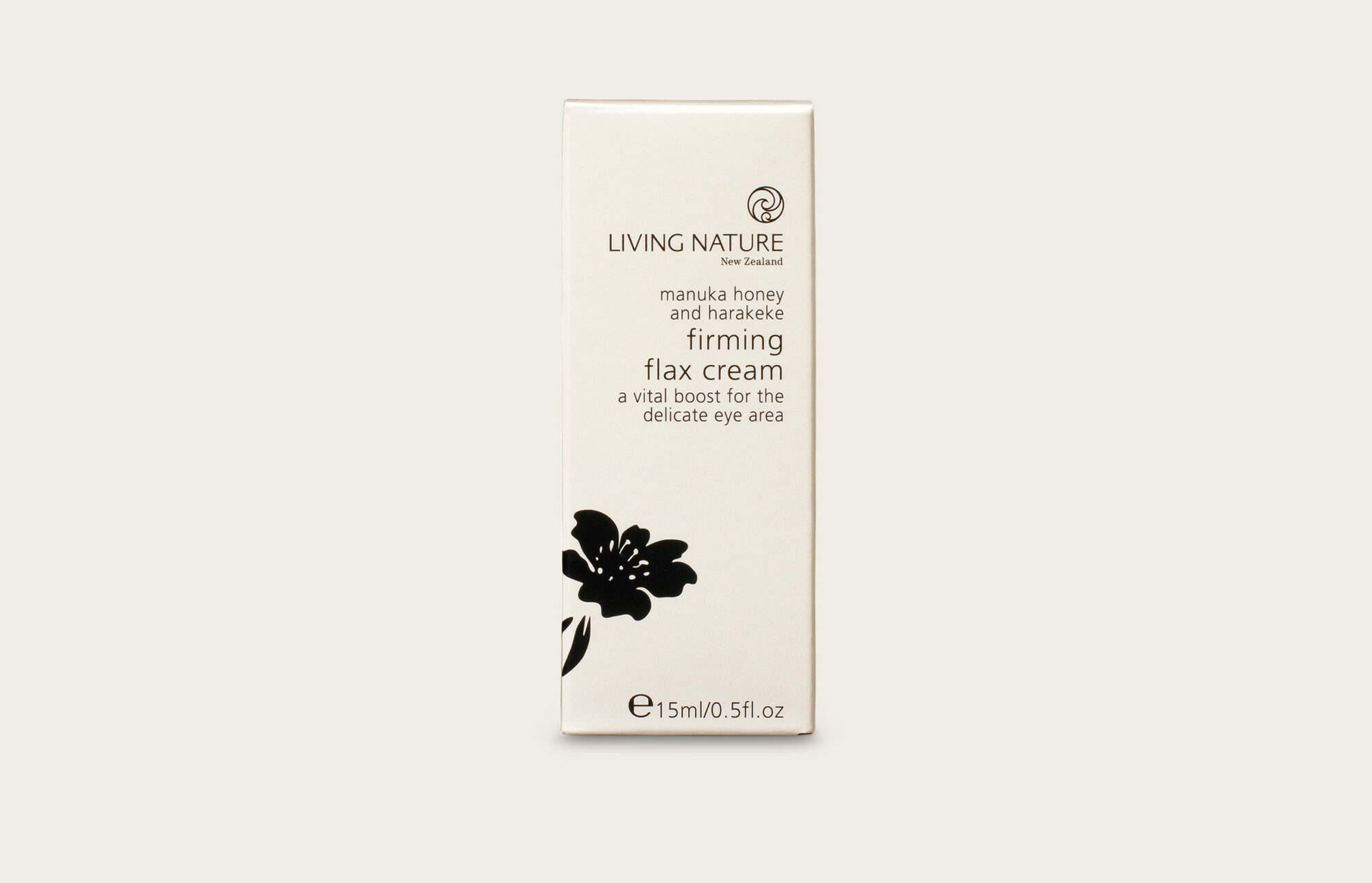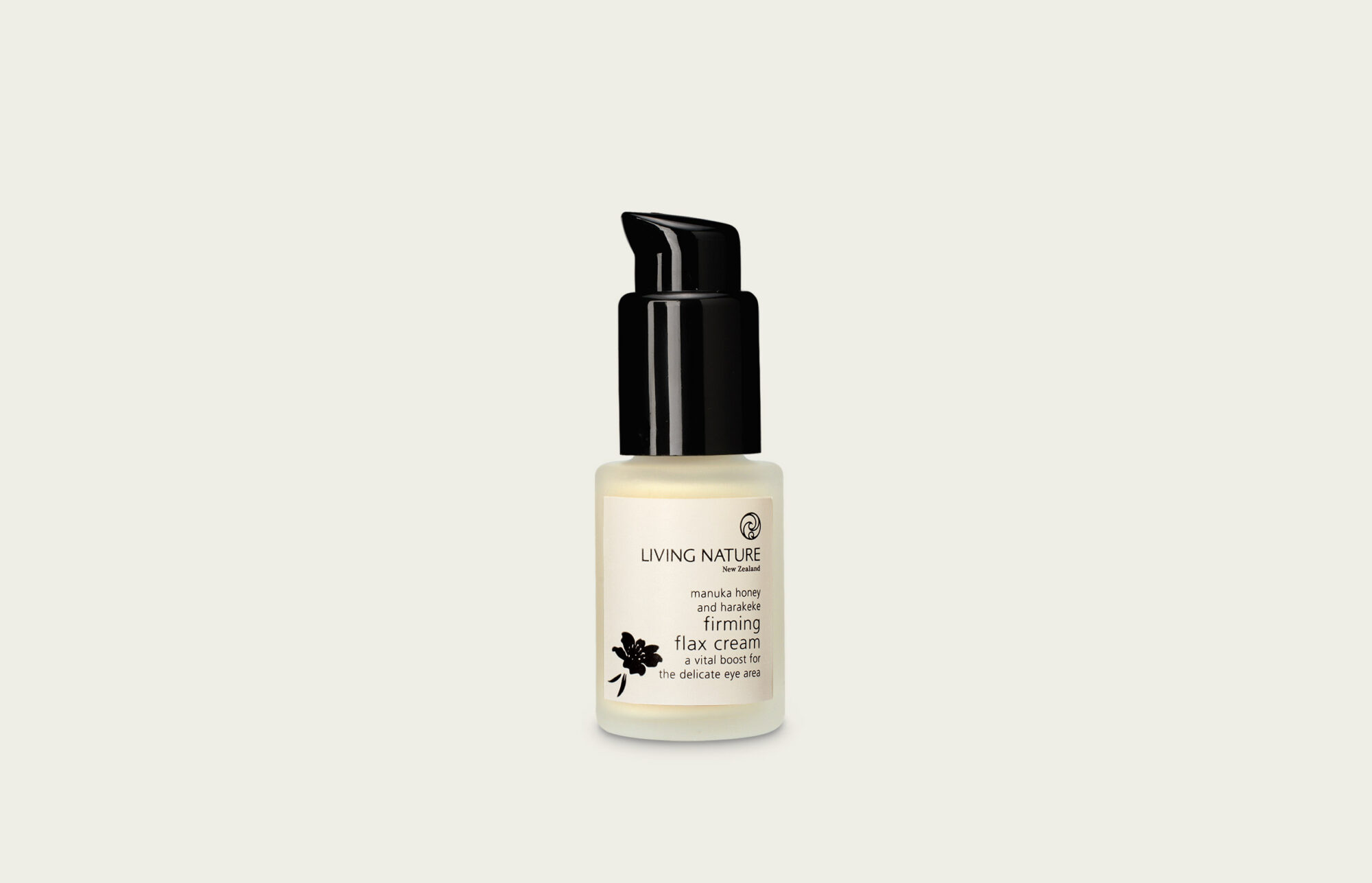
Ethical and authentic, Living Nature was one of the earliest pioneers in all-natural creams for the face and body. But they were more sandal-wearing hippy than credible global beauty brand. Our job was to find the sleeping beauty beneath the homespun packaging. We knew that the new brand strategy couldn’t be some marketing spin because integrity was the very bedrock of this startup business. It required a lighter touch. Because simplicity is shorthand for purity, and it also signals sophistication. So we dialled up these qualities without losing its Kiwi, natural essence. Or its eco cred. Meeting the highest EU standards, the new packaging combines chalk and polypropylene, so it requires less energy and plastic to make. It’s also easily recycled – and designed ‘upside down’ to protect all that good stuff from contamination and air.
