Best in show. | Dow Goodfolk, brand strategy, identity, packaging and digital design agency
Dow Goodfolk
Dow Goodfolk
Q Theatre Yellow Brand Identity

Best in show.

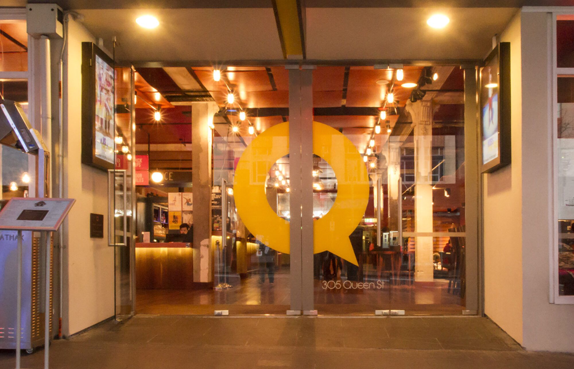
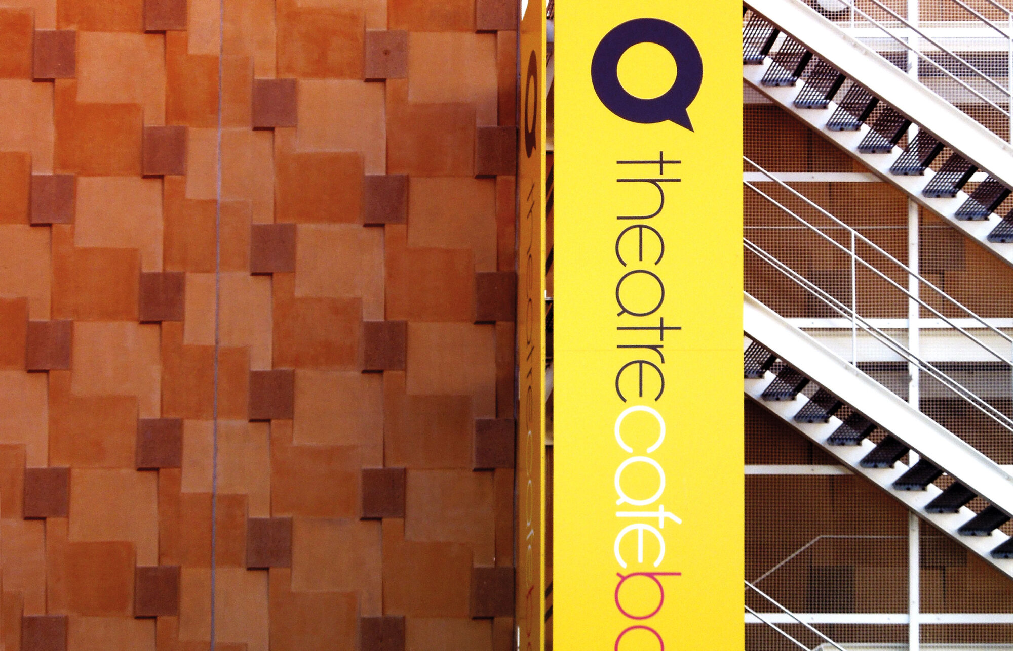
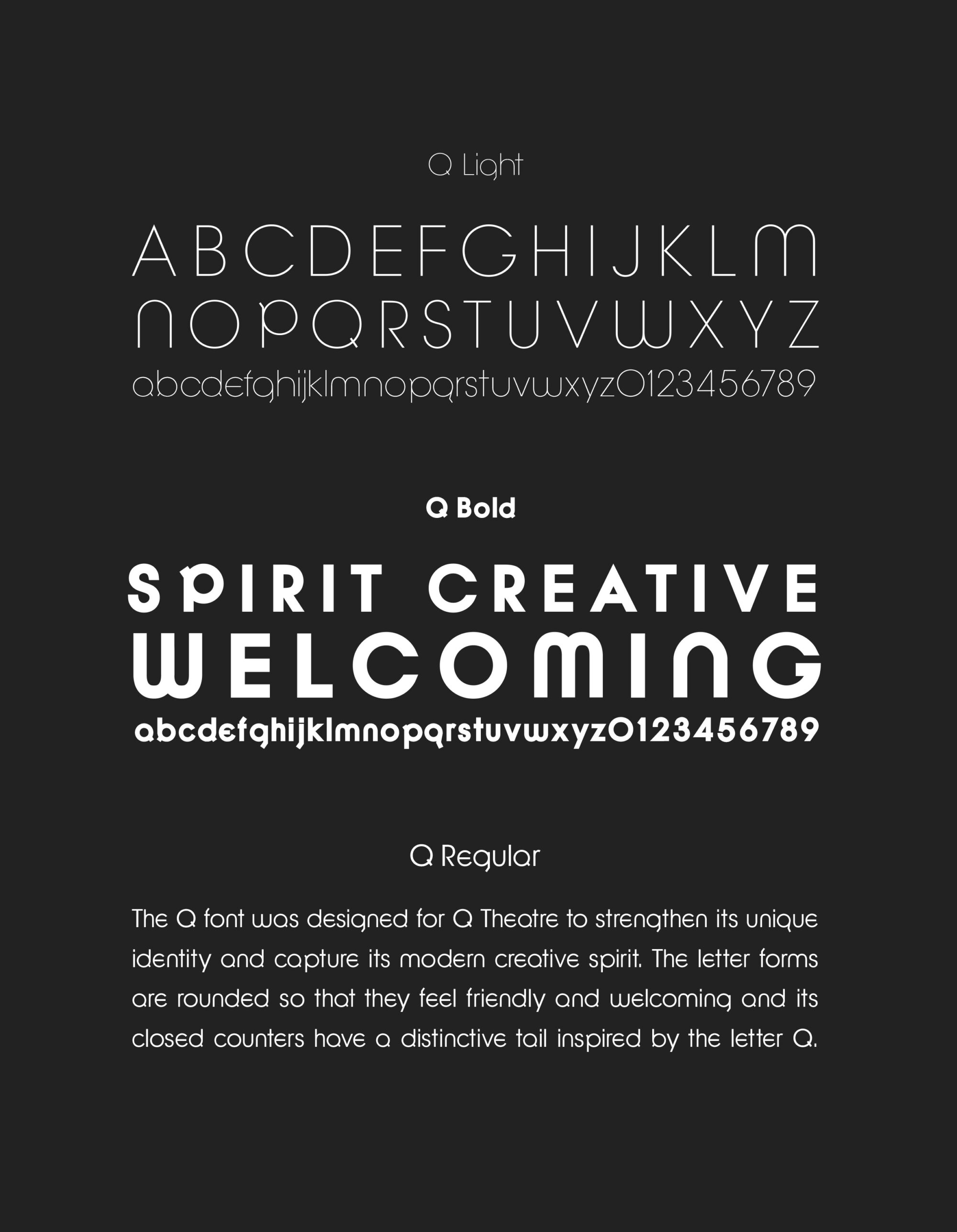
All the world may be a stage. But Auckland performance lovers and makers still needed a space to call home. Enter Q Theatre. A revolution in the arts scene, Q is the Goldilocks of a performing arts space – not too small, not too big. And it couldn’t be typecast – equally suited to drama, music and dance. Fabulous. Except that it was new, and tucked away behind the imposing Auckland town hall. Q needed to stand for something, embrace its diversity and stand out. So we threw the spotlight on the theatre, turning its ‘Q’ into a call out. We also brought the inside outside, opening up the space to the world and lifting the curtain on the creative process. Suddenly Aucklanders got closer to the arts. Thus, a space became a place. One that all Auckland art lovers could call home.
Q Theatre spatial design exterior doors Q Theatre actor makeup photography Q Theatre spatial design exterior signage Q Theatre typography font design Q Theatre book cover design Q Theatre spatial design interior Q Theatre spatial design entrance sign

“Dow have given us a brand that achieves exactly what we needed and even more impressively, things we didn’t know we needed. The process was creative and rigorous leading to a great outcome for us. The brand embraces many diverse people, works in many contexts yet still anchors our landmark building in Auckland. Perhaps my greatest satisfaction is how effortlessly it now rolls off the tongue of the many people who use Q.”

— Justin Lewis, Deputy Chair, Q Theatre.