Did someone forget that fruit is fun? | Dow Goodfolk, brand strategy, identity, packaging and digital design agency
Dow Goodfolk
Dow Goodfolk
Simply Squeezed Brand Identity

Simply for the joy of it.

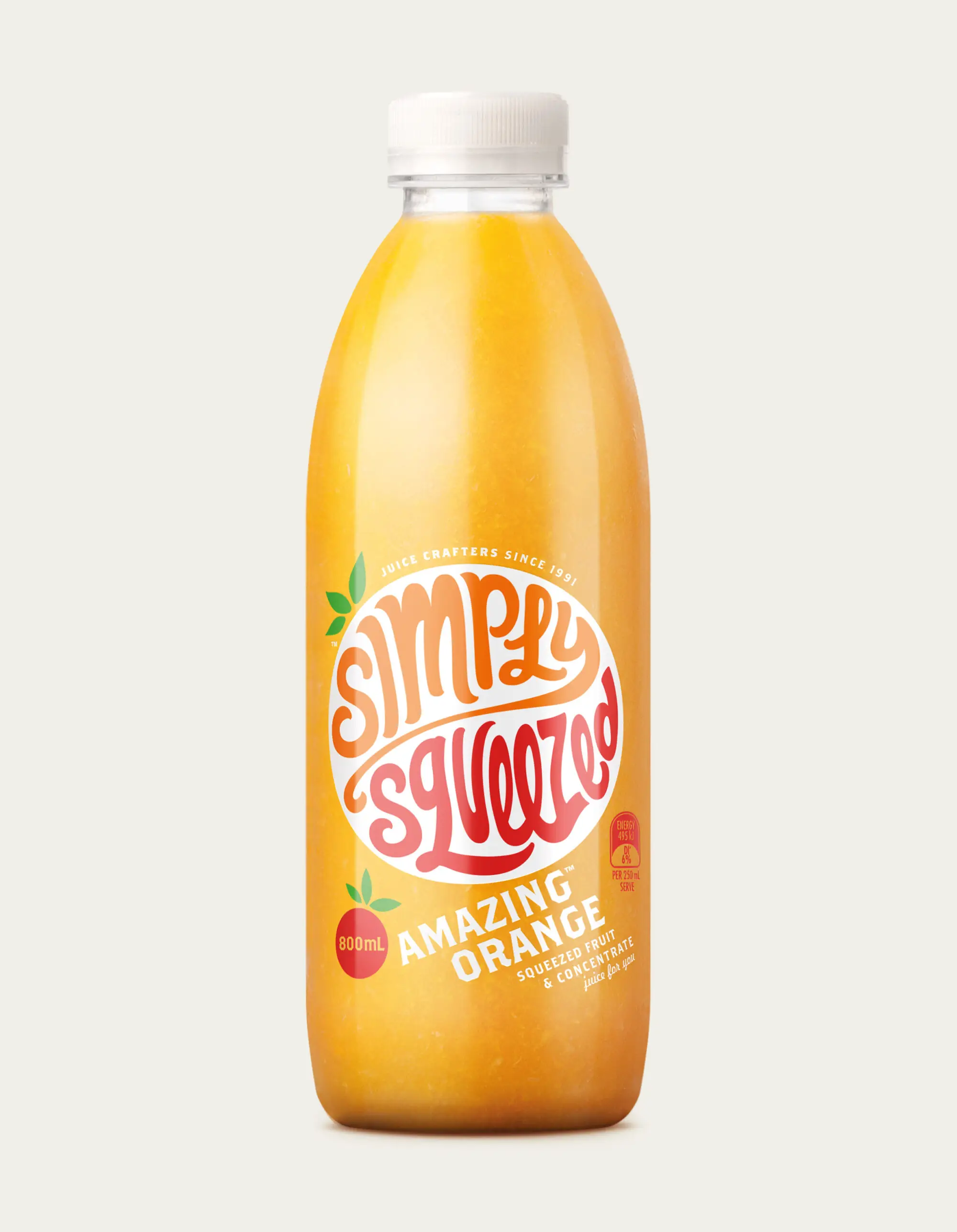
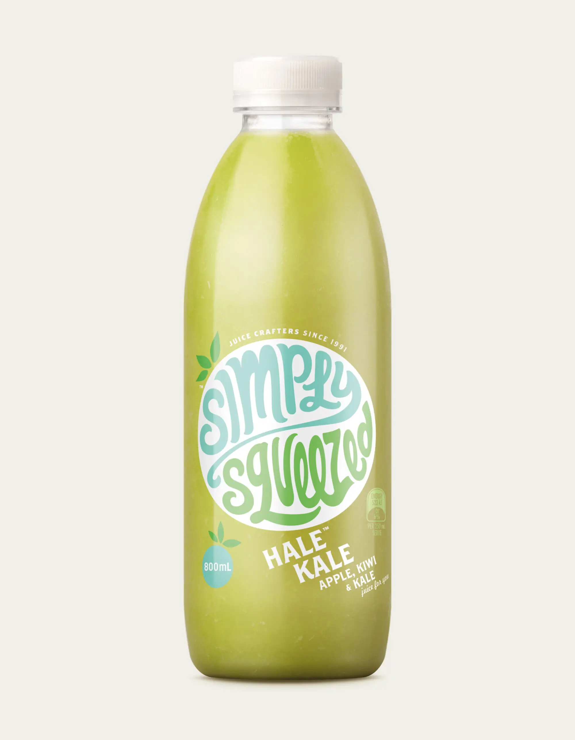
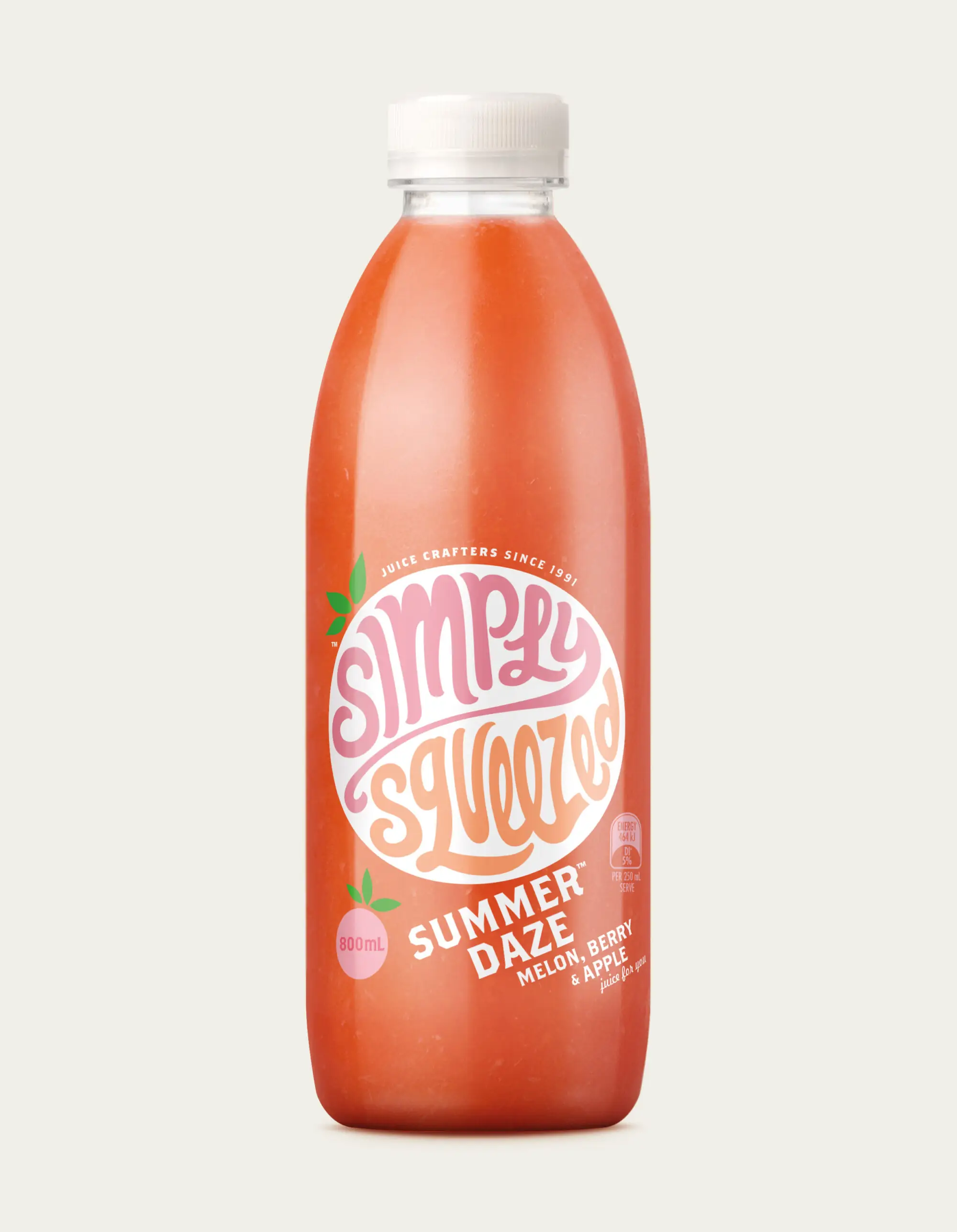
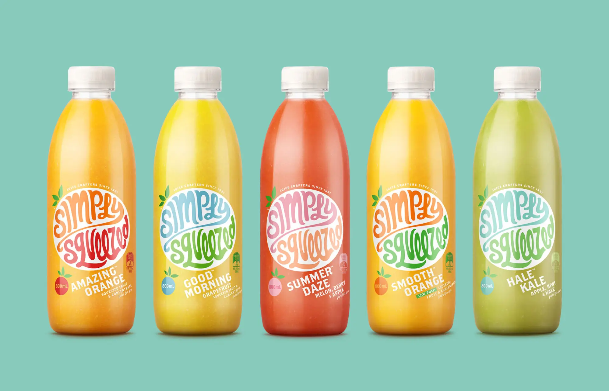
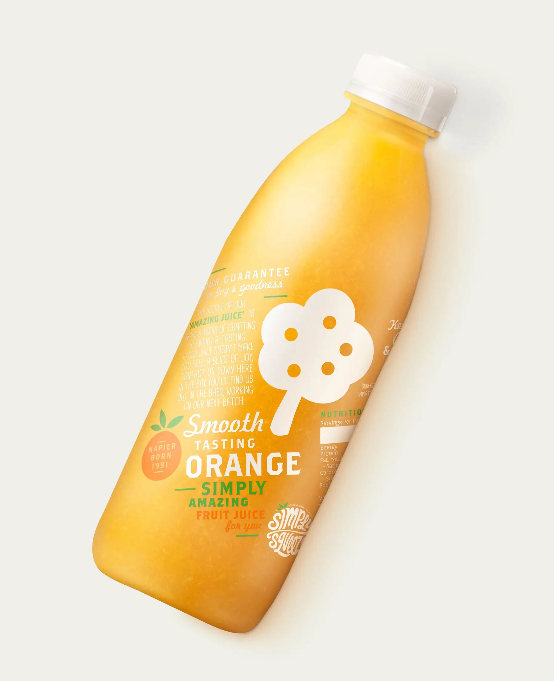
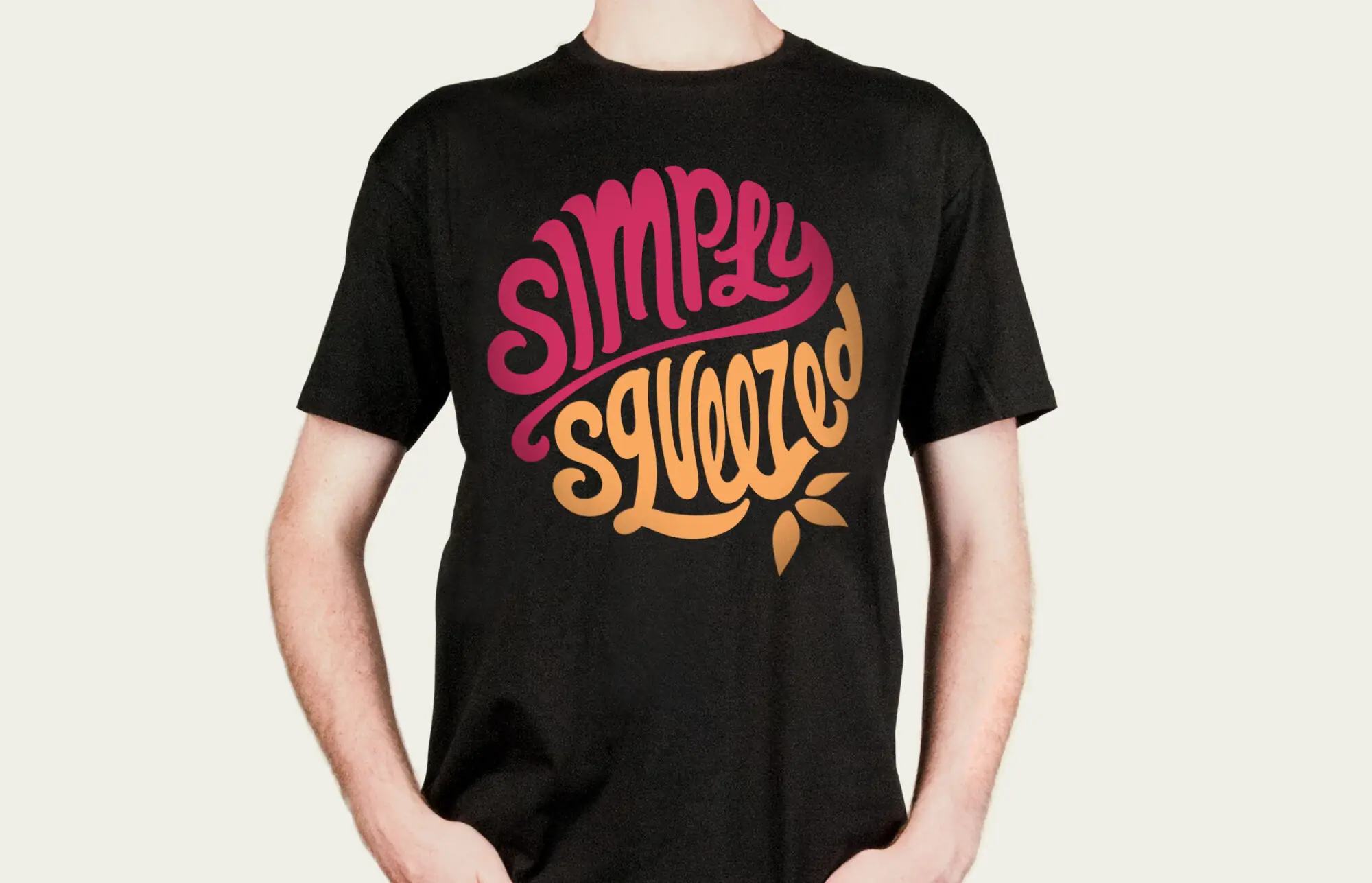
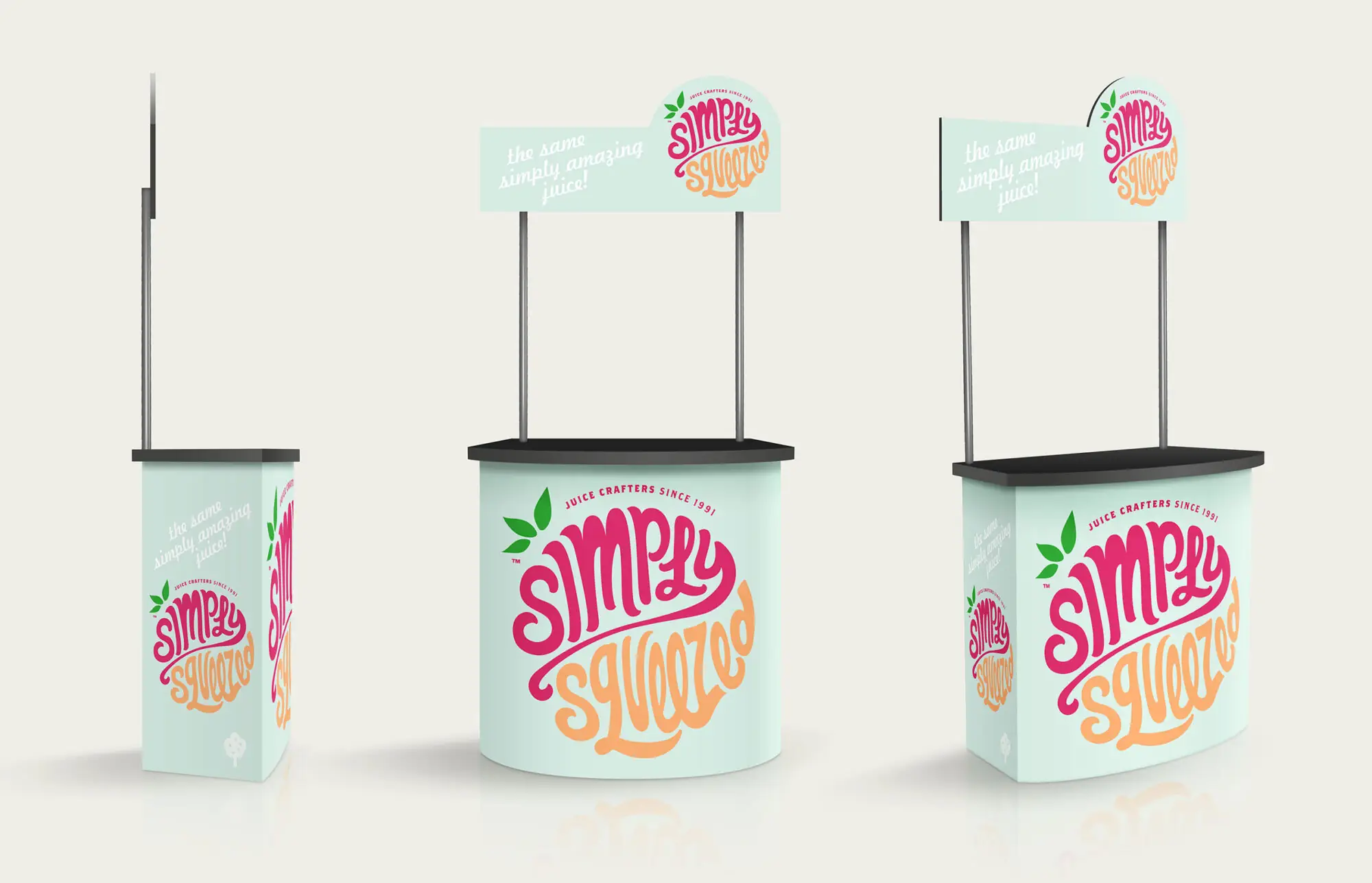
Somewhere along the way, the juice aisle got all ‘pure’, ’honest’, and, quite frankly, ‘holier than thou’ boring. Did someone forget that fruit is fun? And although Simply Squeezed is market leader, it’s what’s happening beyond the supermarket that inspired the shift. Juice bars are pumping, smoothies are rocking and flavoursome. The brand needed a dash of this juice bar vibe. To bring a smile to the lips as well as a glass each morning. Now while we’ve always known the product is good, the logo and label didn’t tell this hands-on story. The name kind of says it all. We wanted to make it the hero, rather than a pile of oranges. So we gave it a bit of hopping and skipping, and it seems like drinkers love that attitude nearly as much as they love the delicious product. Just goes to show you can teach an old brand new tricks.
Simply Squeezed guarantee typography illustration graphic Simply Squeezed product range lineup Packaging Design Simply Squeezed back of pack details Packaging Design Simply Squeezed uniform Simply Squeezed Juice stand design

“We are completely in love with the new look – it hits exactly the right note to reflect our brand.  We loved Dow’s approach; they bring exceptional design of course, but their thinking and practicality really helped us believe this was going to work.  Implementing such a major change can be daunting, but we’re delighted to say that our sales are up and we’re receiving great feedback from our juice drinkers!” 

— Jo Turner, Marketing Manager, Simply Squeezed