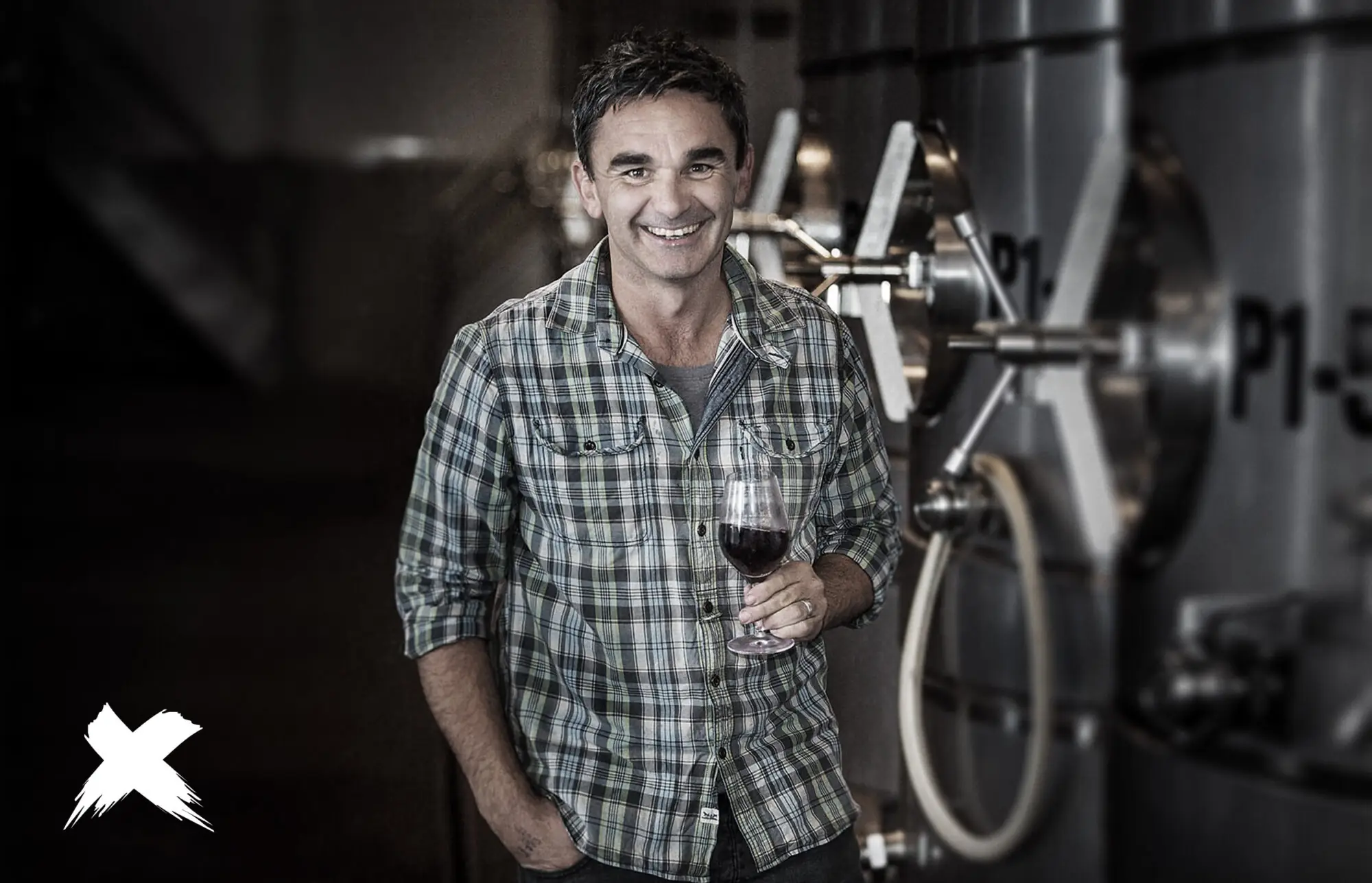
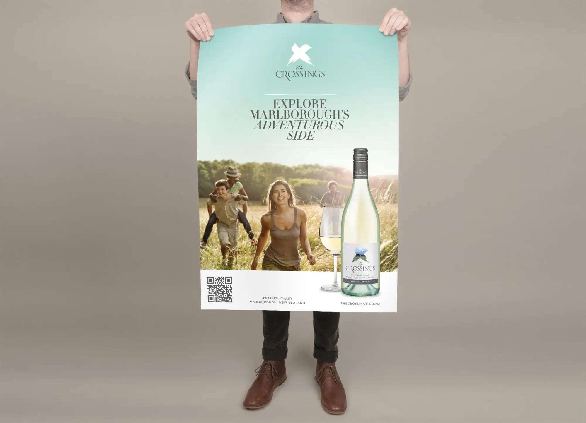
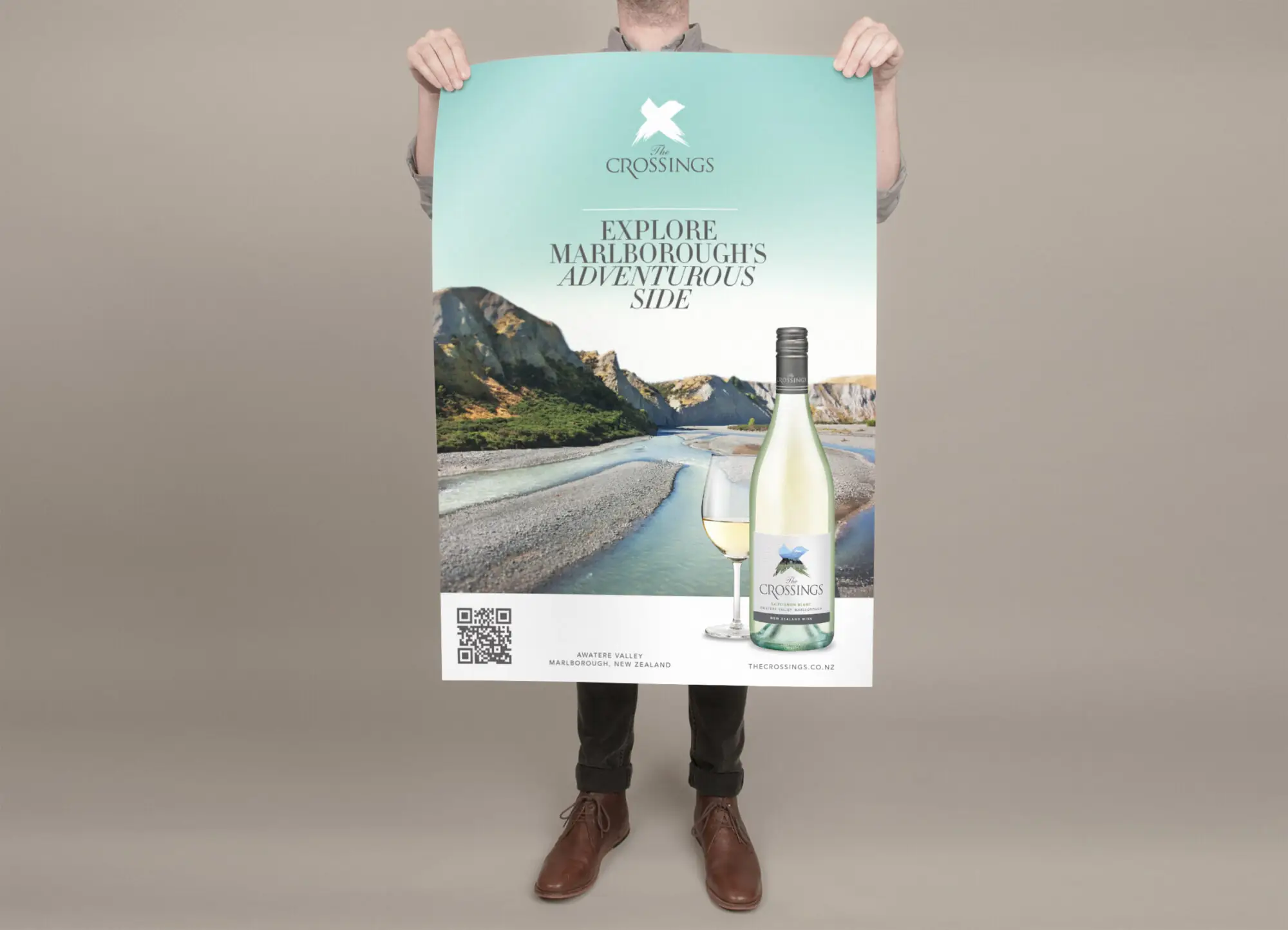
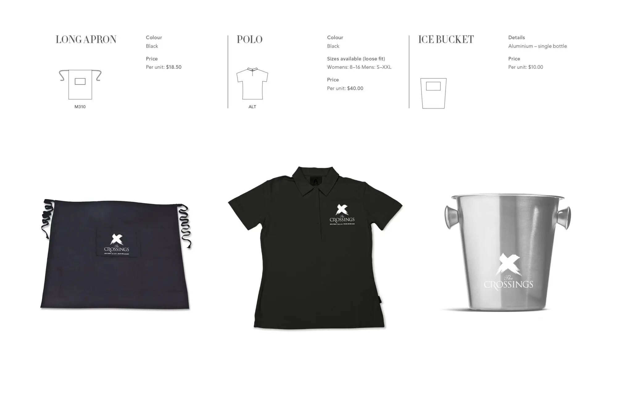
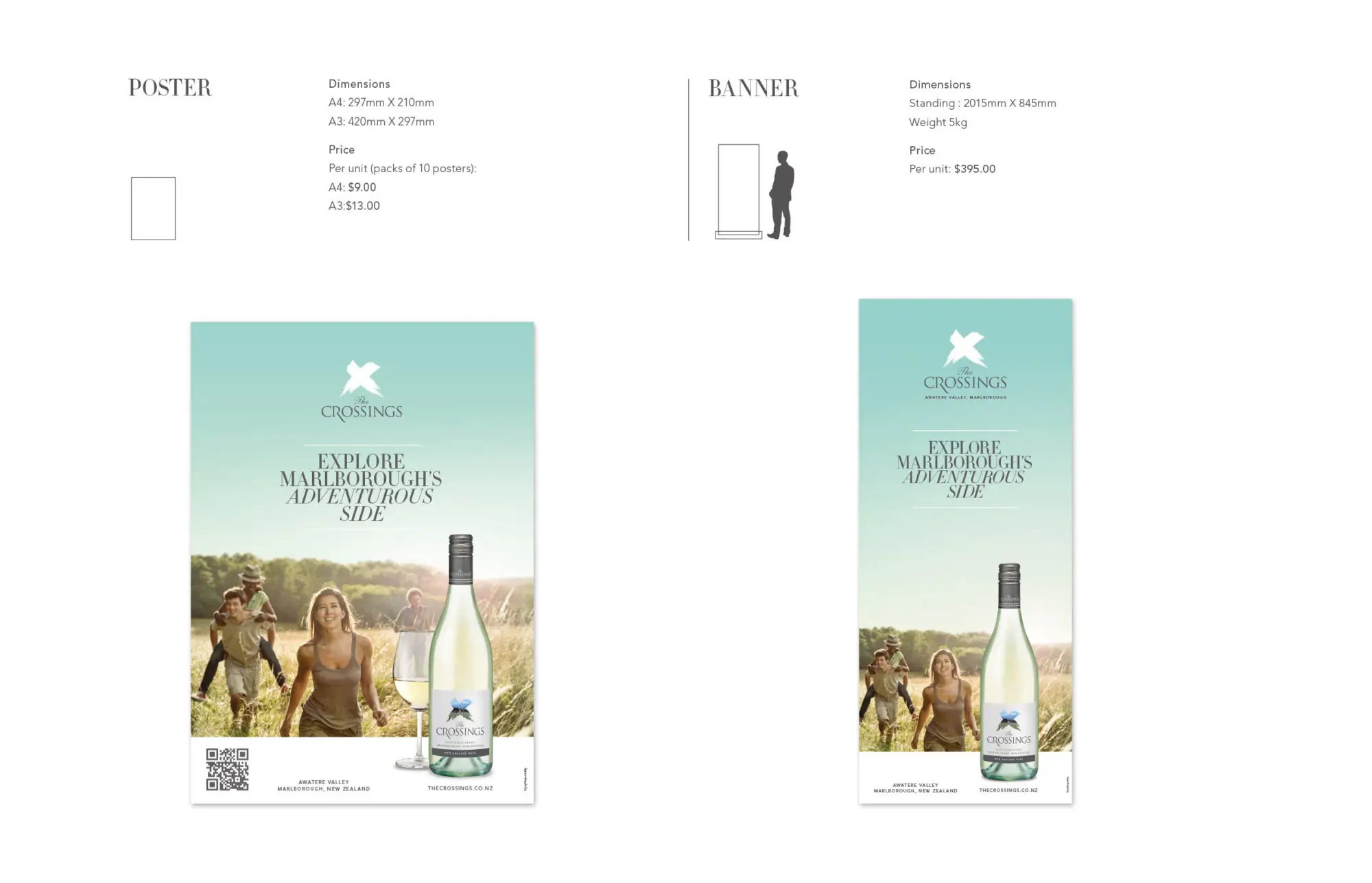
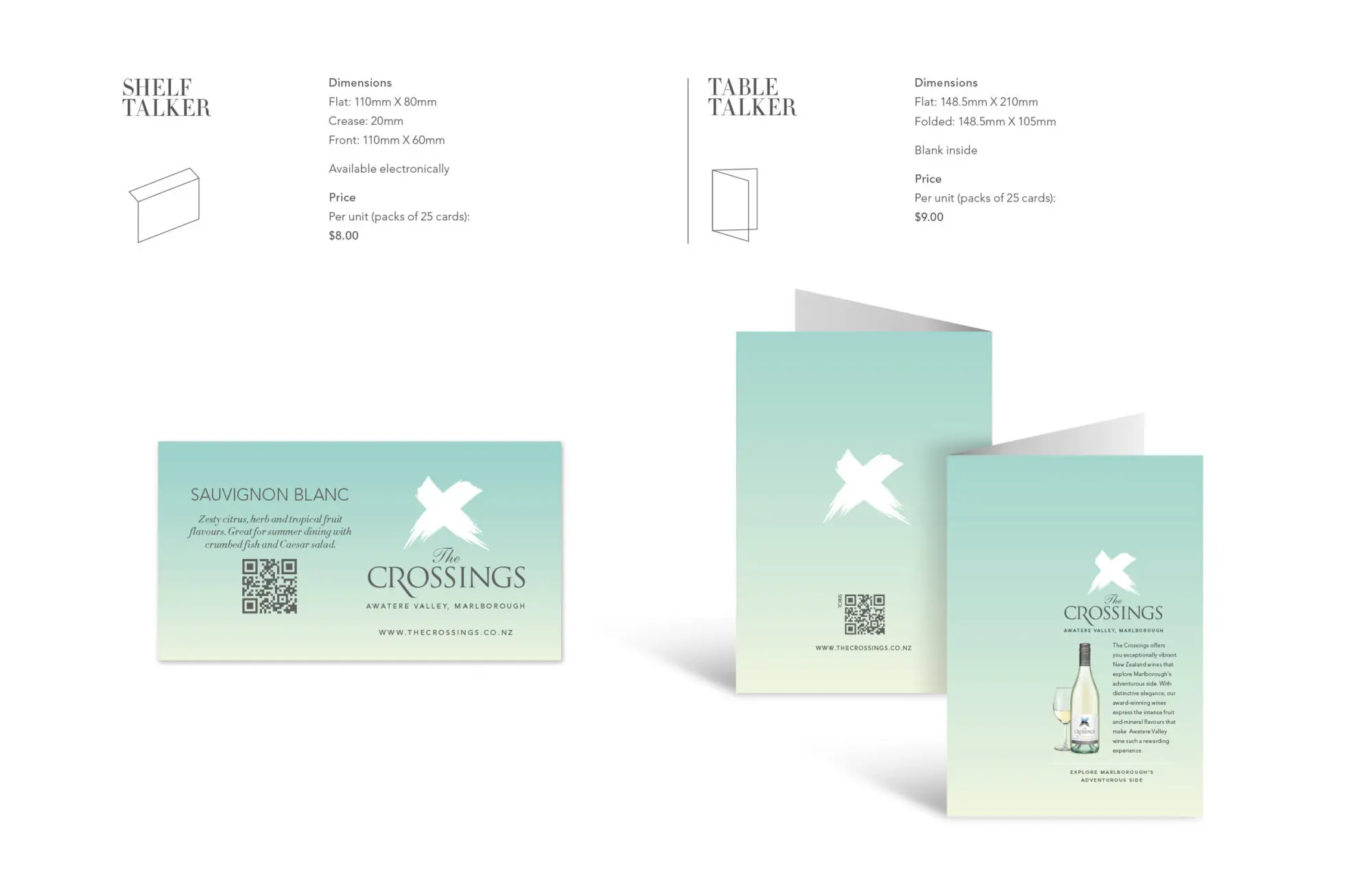
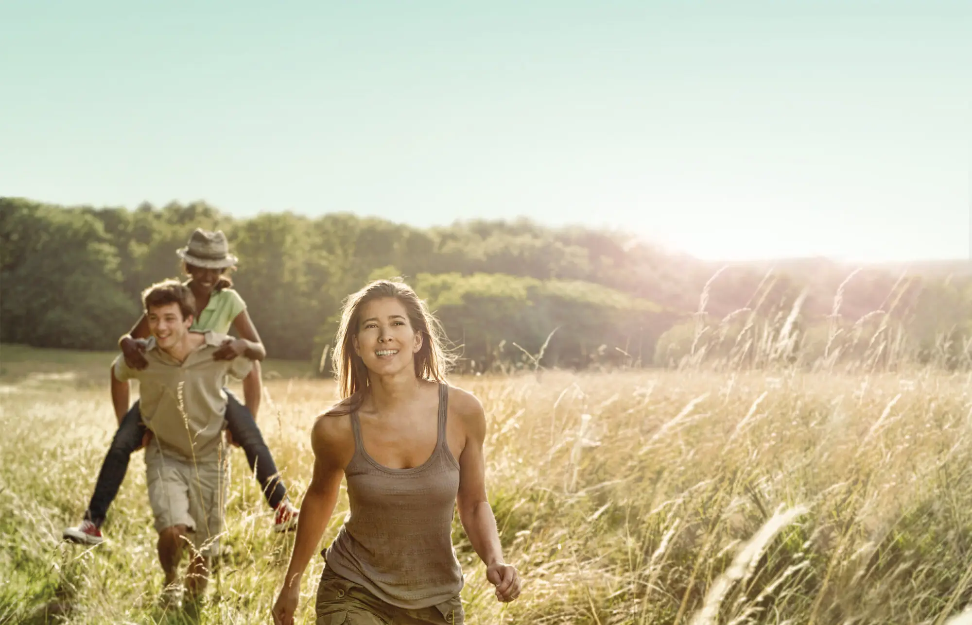
Brand cannot live by label alone. ‘The Crossings’ wine has an adventurous spirit that needed more space than just the bottle to tell its tale. Its sustainable vineyard in the famed Awatere Valley is where pioneers once crossed the Awatere River. So we needed to capture this pioneering spirit. And bring the sense of adventure, discovery and heritage to life for customers wherever they encountered the wine: on posters, the website, tasting notes, merchandise and more. We eschewed clichéd shots of social gatherings, tables groaning with antipasti and frivolous chatter. Using instead, images that communicate a sense of having arrived. The feeling that a glass of ‘The Crossings’ is what you look forward to, post-adventuring. The palette was drawn from the Awatere Valley’s unspoilt nature, and the light quality of a lingering Marlborough summer.