We chat with Ben, maker of beautiful imagery since before [photoshop] history began.

Tell me about your 15 years of diverse creative industry experience? What has that diversity been and how?

Back in 2001 I got my first (not so) creative job scanning and retouching fluff off transparencies at a magazine publishing company. Thankfully after a few months one of the designers left and I moved into the vacant position and started creating magazine layouts. From there I have ping-pong'd my way between design studios, advertising agencies, marketing agencies, printers, publishing companies and working directly or in-house with clients in both production and design roles. I am lucky to have worked across a wide variety of projects for an eclectic range of clients, from food packaging to online surf shops, bottle caps to building wraps, with magazine editors to tradies to financial experts and more…

You’ve also ping-pong'd your way from Manchester, UK to Auckland. What brought that about?

During my travels I spent a few months exploring NZ in a rusty old Toyota Camry and fell in love with the place, two years later I moved here for good. I chose Auckland because it has a thriving creative industry, beautiful surroundings and slightly less rain than Manchester.

Retouching is your passion, what is it about retouching that you love so much?

I enjoy making imagery look as beautiful as possible and taking visuals to places outside of reality. My inner child likes to make things look better than real life and I get a great sense of achievement doing so. It’s also good fun.

When you’re not retouching or managing production, being from Manchester do you kick back to a bit of Joy Division, The Smiths, Take That, Man City and catching up on a bit of Corro or is there something else you do to occupy your time?

Joy division’s tragic end came before I was born so I never really got into them. I have been lucky enough to enjoy the thriving Manchester music scene that they helped to create though so I like them for that. I find Morrissey thoroughly irritating at best. Take That – I’m not really their target audience. Man City – to quote Paul Scholes, “United will always be the number one club in Manchester. The Hacienda is probably still second and it's been shut 20 years”. Coronation Street – I’d rather saw off my leg. Instead of partake in any of your suggested pastimes I prefer to spend quality time with my family, brew beer in my garage and make music (noise).

If you could choose one retouching/photoshop function/tool to work in real living life what would that be and why?

The eraser tool so i could erase all the bad stuff. Actually no, I’d like the ability to create masks. That way I could get rid of all the bad stuff non-destructively, allowing me to hold the world to ransom with the threat of shift > left click.
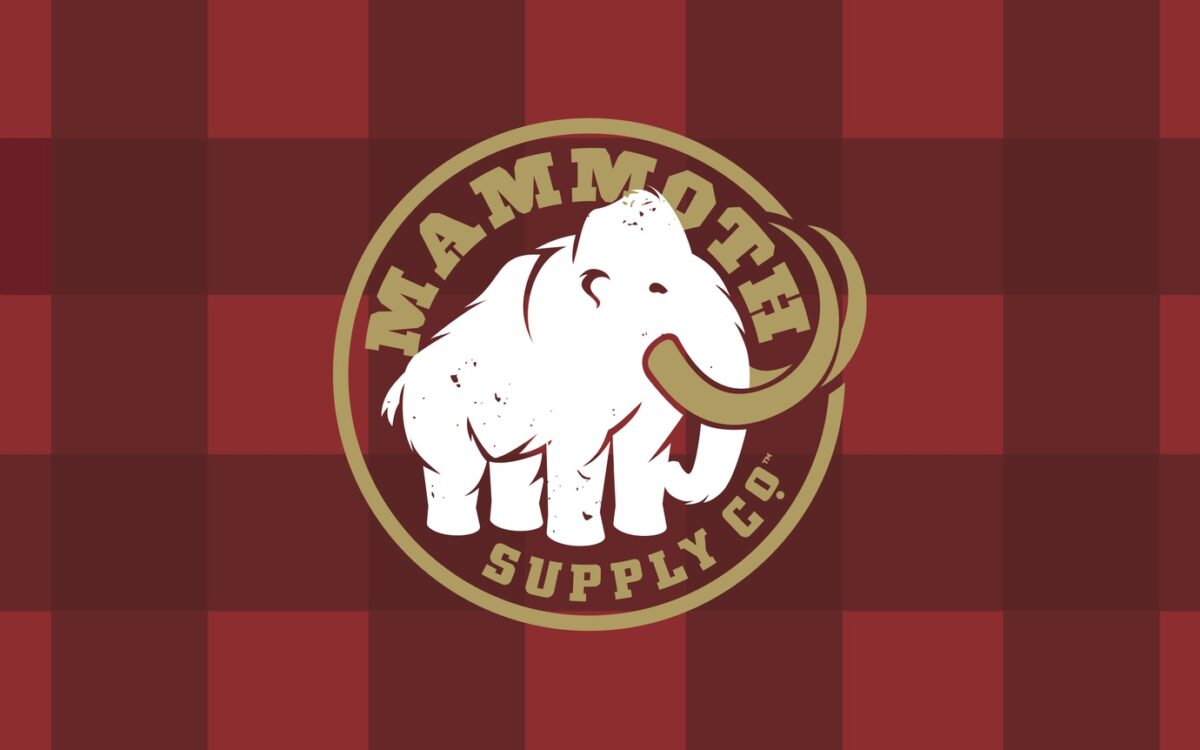
Nothing woolly about this Mammoth

Mammoth too long a sleeper in the beverage category is enjoying phenomenal growth – up 30% $ growth (MAT), since its makeover and re-launch. What’s the secret? Shaking off its woolly reputation to give the brand a much stronger presence and a clear appealing story. Common sense you’d think, but as they say common sense is uncommon. 45 grams of protein, made from real coffee with a proper coffee taste – Mammoth is the real deal, and now its pack is too. So that’ll keep it off the endangered species list for some time, and we’ll raise a Mocha or two to that.

A75ae724d7853ee6cbf13c6f510fca79

Rangatira full-year operating earnings rise 23%, raises dividend

As noted in a recent NBR article, "Earnings rose to $11.5 million in the year ended March 31, from $9.2 million a year earlier, the Wellington-based company said in a statement. Net profit jumped to $50.2 million from $13.7 million and included a $36.3 million gain from the revaluation of its stake in smallgoods maker Hellers, which has been consolidated as a subsidiary." Read more

We are glad to see Rangatira enjoying the success of backing Hellers as much as we have enjoyed partnering with them over the last twelve years.

In a tough and shrinking market it is great to see the Mac’s relaunch shining out as a beacon of success for Lion.

As Edwin Mitson noted in a recent NBR article on Lion’s full-year earnings, “in February, Lion said sales volumes had fallen 4.4% in New Zealand as the alcohol market declined to its lowest level in 18 years. Statistics New Zealand said the total volume of pure alcohol sold in the country fell 4.1% in 2015.  

Lion, which is owned by the Japanese brewer Kirin Holdings, has described the New Zealand beer market as highly competitive. Falling sales reflected aggressive pricing and promotion, although a re-launch of its Mac's brand had produced growth of 10%.”  

While business is clearly tough, it is great to see Lion being rewarded for shaking things up and investing in Mac’s, and that success is something we’ll raise a Hop Rocker to.

Full NBR article → here


The rational versus the emotional. Our very own Design Director Kirsty gave a talk last week at Design Assembly’s Autumn Conversations.

She shared this simple story that we felt really aligns with the Dow ethos of EMOTION first. In a nutshell, it goes this way:

That the elephant rider (your rational side) thinks it is steering the elephant, but it is actually the elephant (your automatic, intuitive and emotional side) that has the far greater power, and can take over at any moment and dictate where you go.

The elephant analogy (originally by Jonathan Haidt, 2006) is a great way to explain how humans operate and make decisions. We prefer to think we are rational and reasonable: weighing things up before deciding, making the optimum choices for our lives. But the reality is that so many of the decisions we make are actually automatic and intuitive. We don’t actually have time to duly consider everything we are doing. And so we operate out of instinct and emotion.

Effective design then, connects with the elephant, not the rider. Easy on claims, big on wit, delight, surprise.

See more about the talk here

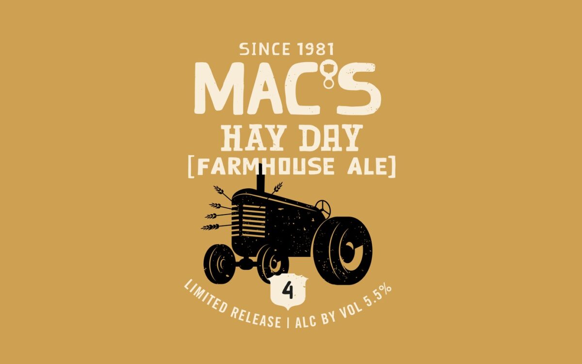
A new brew now on the taps

Mac’s Hayday seems to be in its heyday, as it was completely sold out when we went to try it this weekend. We will have to keep our shirts on and wait patiently for them to re-stock, but we’d rather be wearing these cool tees while we wait.

83cbe6bc6f20fe3fbb5b377abb316192


Outstanding design is above all a labour of craft - it’s not writing a manifesto on the back of a napkin.

It’s about the hands-on building of concrete things you can hold, touch and see, but even more than that, it has content that counts. It means refine-refine-refine, produce-produce, review-review, and filter. Piles of paper (thank God for recycling), in the push for greatness. From brief to bar. Enjoy.


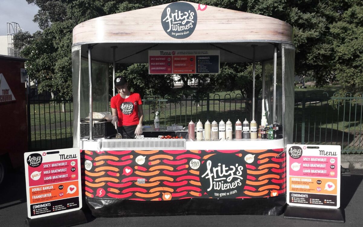
Fritz's Wieners were getting cold, so we cooked up something new.

Christchurch, 2004 — two friends decided there was gap in the food-stall market for traditional braturst sausages, served with saurkraut and a smile. Fast-forward eleven years, and Fritz’s Wieners now have a fleet of specially designed food-carts serving tasty sausages across the country.

Fritz's had loyal, enthusiastic consumers and the business had grown dramatically, but they felt they needed a new look that was as fresh as the baguettes they served their wieners in.

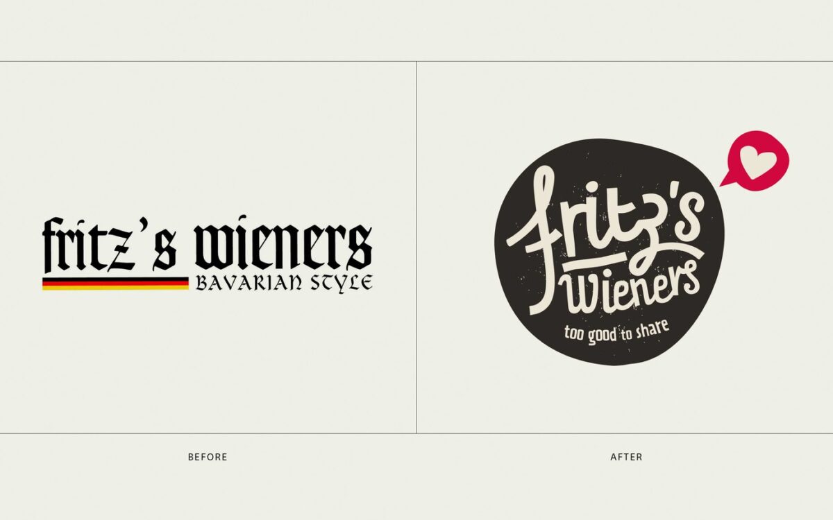
Being very familiar with the successful work Dow had done with fellow Christchurch-based business Hellers, they approached us to ask for a rebrand that would emphasise their fun, fresh, modern offering.

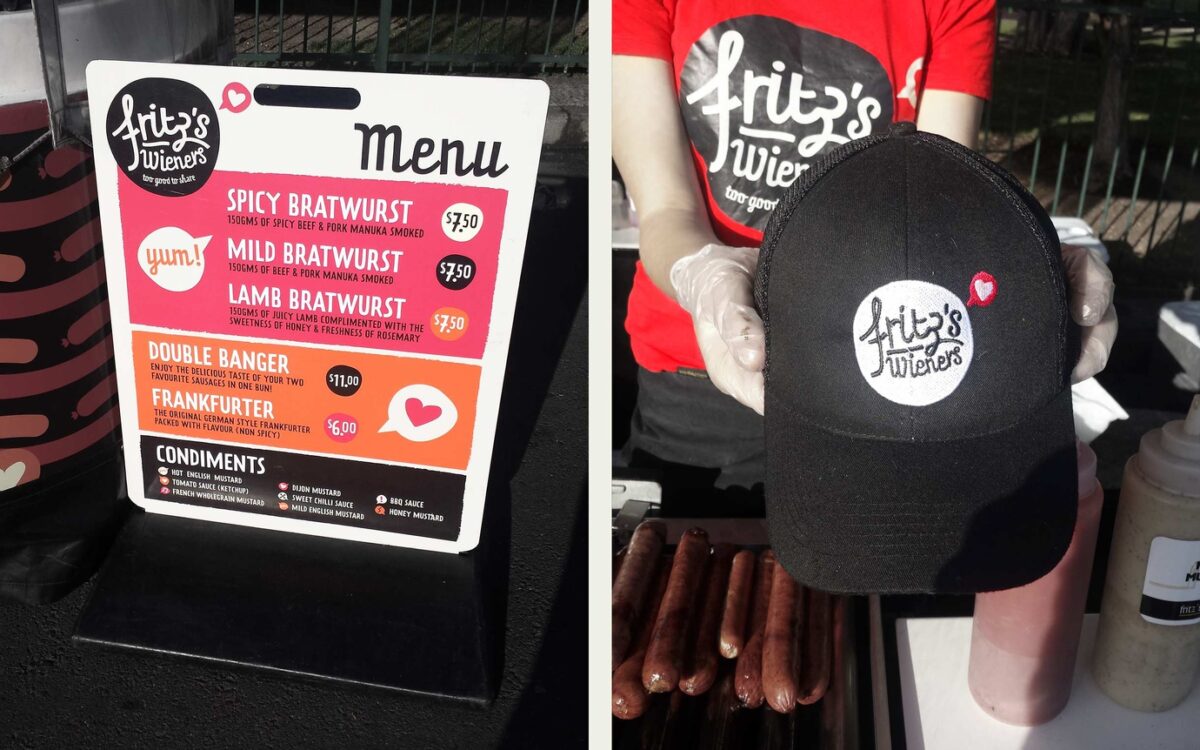
So, we have approached the task with relish, reinventing the more traditional crafted Bavarian style. We’ve introduced a more contemporary palette and iconography, and a font that suggests craft, but is also relaxed and fun. All these design assets were about making Fritz’s feel fresh and crafted, but also showing that they don’t take themselves too seriously.

9e254ae2afb7b7590bf5cca8f7c29a74 74857de4d208d350ef4c97e0b63711b6 B7dbf44003a2e7e5cb33428c005791ac

The design has begun to rollout across the country, and so far the response has been fantastic. Hot diggety dog!


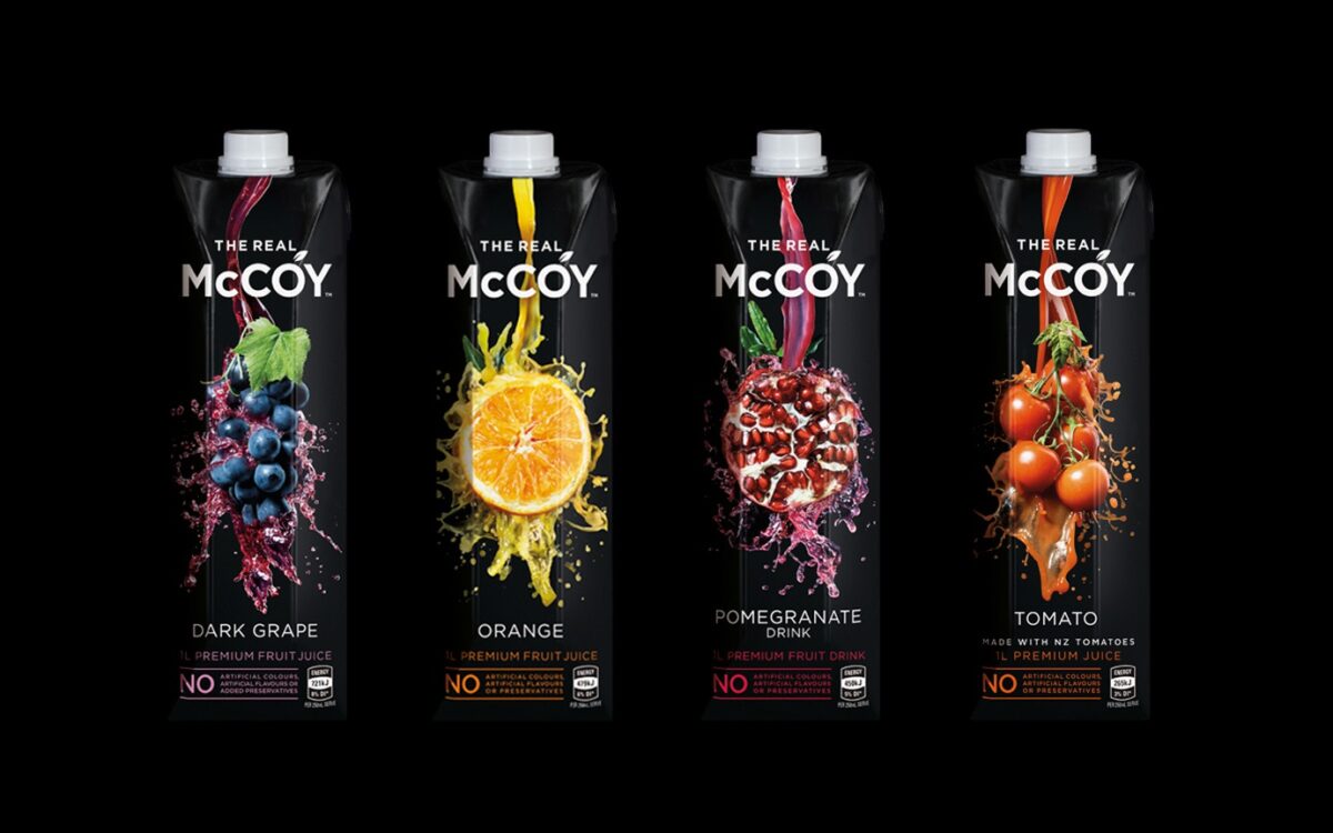
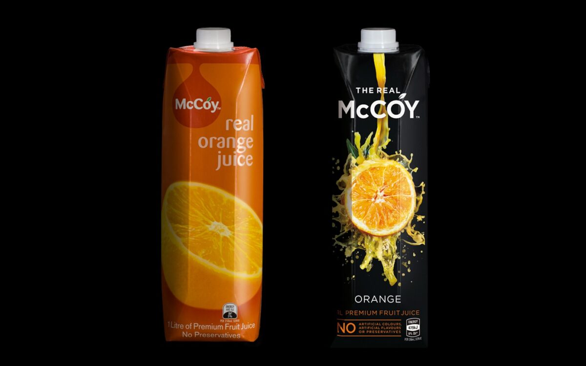
Reinvented for a new generation of juice enthusiasts, Frucor’s McCoy juice gets a makeover to keep the brand at the forefront of premium shelf stable juices and juice drinks.

But the reworking of McCoy did raise vexing questions most marketers will face when managing established, performing brands; do you transform the brand to stay ahead of the curve? Or do you evolve incrementally, or not at all, so as not to lose what made the brand successful in the first place? It is all very well to talk transformation when a brand is broken, but what if it is still market leading? Baby, bathwater and don’t throw out, all come to mind. Often in this situation most marketers would opt for evolution, but not for Frucor and Dow with their stunning new branding for McCoy.

When Frucor and Dow ran the ruler over the market and the existing McCoy pack, it seemed the foodie revolution had bypassed the juice aisle. Consumers were trading down in shelf stable juices and juice drinks, or even out of the category, not seeing the value in the more premium options, and why should they?   The aisle hadn’t evolved at the same rate that foods had and there was a need to bring exceptional design and premium appeal to the shelf.

21757b4c9625230e581a9cdea589d725

The McCoy brand was far from broken.  The tall, elegant prisma packs and the simplicity of the single fruit colours had managed to keep McCoy’s head above the others in the category for more than ten years.  But according to Dow’s Creative Director, Donna McCort, “the category was becoming more confusing, which wasn’t helping McCoy. As the rest of the supermarket was going all Masterchef and MKR, the juice aisle lacked some of these authentic food cues.  So we took the single fruit essence of the brand, and injected it with sophistication and craft.  Hence the black background, the real, still life quality of the fruit and the natural splashing juice, that although transformational, cues authenticity and remains true to the real McCoy”.

The commitment to authentic food values is more than pack deep. A prior partnership with Simon Gault had proved that McCoy was the perfect match for the foodie culture.  To link in with that foodie vibe, recipes have been introduced on the back of packs in the new design, giving consumers creative new ways to use their favourite McCoy product.  “The packs don’t just look stunning, they have captured the true essence of the brand, The Real McCoy, but in a progressive way that reflects important food trends.  That’s a very difficult branding task to pull off so distinctively for a product as established as McCoy. So we are absolutely delighted with the results,” says Joel Reichardt, Senior Brand Manager for McCoy.

A7b1ba67a590f5d988dcc101d48cd8f4

The new McCoy packs will start appearing on shelf at your supermarket and convenience store this month, just in time for the summer entertaining season.


Creative Director — Donna McCort

Senior Designer — Tony Masterantonio

Account Director — Emma Johnson

Marketing Manager — Monica Yianakis

Senior Brand Manager — Joel Reichardt


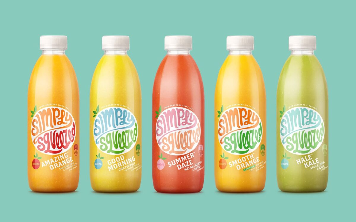
Simply Squeezed wins at Pentawards

We were thrilled to hear that once again our work ranks amongst best in the world, winning at the highly competitive Pentawards in London over the weekend. The successful Simply Squeezed design beat off a world of competition to win bronze in the hotly contested beverage category. “It’s always a special thrill to win against the world’s best. Very proud.” said Dow’s creative director, Donna McCort.

It is a great recognition of New Zealand design on a global stage, and reflects how well the new look Simply Squeezed has been received since its re-launch. As Jo Turner from Simply Squeezed commented, “we are completely in love with the new look – it hits exactly the right note to reflect our brand, and we’re glad it seemed to hit the right note with the Pentawards’ judges too”. “I love the simplicity of this design. It’s all about the brand. Which is what we believe in”, added McCort.

Bc2cf12b63a8f4dad44f248f10433e32

The Pentawards is a major worldwide competition, and one of the few global design awards exclusively devoted to packaging design in all its forms. To win at these awards the design solution has to be world class and demonstrate a deep understanding of the specialist expertise required to create stand-out consumer packaged goods design.


For more visit our Simply Squeezed case study.