Amidst the rugby madness that’s gripping the nation, Anchor has made a bold statement by turning its traditionally white milk bottles black. Does packaging that has a point of difference equal more sales?

With household items like milk or butter, branding and packaging tends not to stray too far from well-known designs and shapes, as to not alienate the audience. But Anchor has decided to diverge from the norm and teamed up with Colenso BBDO to release a black milk bottle in support of the All Blacks.

It was a just a couple of years ago that Anchor copped a lot of flack for changing its milk bottle design to be lightproof, with milk levels invisible from the outside. It was entirely new territory for milk drinkers, as they’d always been able to see the milk in transparent bottles. A poll at the time by the NZ Herald revealed many were against to the change, with 78 percent of the 16,600 respondents saying the bottles were a waste of time and that the old containers were fine. Just 13 percent thought they were an innovation. But despite the outrage, there was still a 10 percent increase in sales in the first month, showing humans can be an irrational species when it comes to change.

2670018ae727d2b7510c04617c054d29

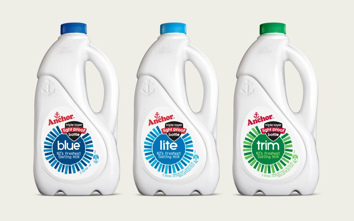
Dow Design group account director Simon Wedde says Anchor’s switch to lightproof bottles paid off. “The reality is, it did improve sales and gave Anchor a point of difference,” he says. “It’s led to a sustained point of difference and consumers have a good understanding about it now and how it protects the milk.” Anchor’s been at the forefront of product redesign. Prior to the lightproof bottles, it completely changed its milk bottle shape in 2002.

It swapped the traditional square shape for a curved bottle and added cow illustrations to its logo. Though seen as risky, Wedde says there was a 30 percent growth in sales at the launch without any advertising. He credits this to better ergonomics (it made it easier to hold and pour) and because there was more personality brought to the bottles by using animal illustrations. “It was taking a simple product and injecting it with some emotion and personality,” he says.

27e656ff14b3d976be17b96ac2631215

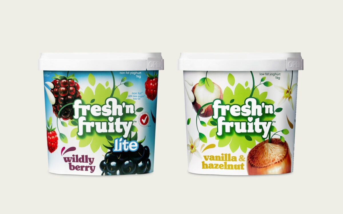
Fresh’n Fruity also rebranded in 2009. At the time, Wedde says, most yoghurt brands’ packaging put the primary focus on flavour. To stand out, they turned it on its head and made the Fresh’n Fruity brand prominent - more so than the yoghurt flavour. At the time of the rebrand, there was immediately a 12 percent growth in sales volume at without any advertising.

1ce489421b2439a30940f43c3d9b2eeb

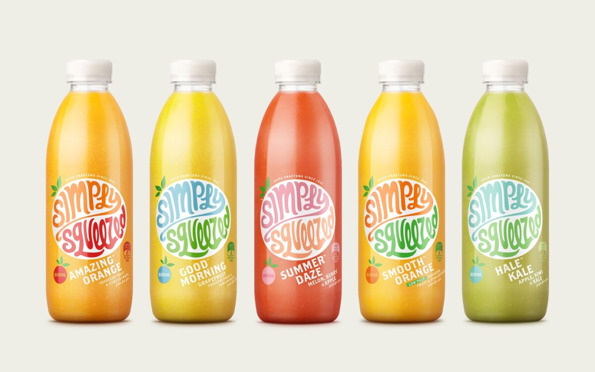
Simply Squeezed also got a fresh new look from Dow Design. After researching what customers saw on the juice aisle, Wedde says they noticed every juice brand was doing the same thing. “It was a race for who can become the most boring. Everyone was shouting, ‘I’m the purest, I’m not from concentrate,’ but if you keep shouting about a functional story you are commoditising it. What value are you adding?” he says. They decided to take the design back to being about juice being fun and exciting with a redesign that didn’t feature any clichéd oranges or leaves.

There isn’t any sales data Dow Design can release, but Wedde says the client is happy with the results. “It’s finding a way of talking about the product that is a point of difference - it doesn’t have to be unique but it has to be relevant - and I think that’s what Simply Squeezed did. There was a lot of talk about purity and fruit in the market, but I drink juice for pleasure, as there’s a lot of joy in the juices and the flavours. I’m going to respond to that. So is there a connection between branding with a point of difference and sales increasing?

Wedde says with a redesign, you should see a strengthening of the brand. “I think when it comes to design and pack design, particularly in supermarkets with consumer packaged goods, there is a direct correlation. You will either see a sales volume increase or less reliance on price promotion,” he says.

If a company hits the nail on the head, packaging-wise, he says this will also lead to a price premium. But there’s a fine line between innovating a product and staying current to the consumer, he says. “You can stand out by breaking all the norms and conventions and being unique, but unless that’s relevant to the consumer and true to the product it won’t really work.” In order to stay relevant, he says companies should look for product truths and what they’re doing differently.

TRUTH IS THE KEY WORD, AS WEDDE SAYS; CONSUMERS WILL EVENTUALLY WORK IT OUT IF A COMPANY'S BRAND IS PRETENDING TO BE SOMETHING ITS NOT.

“The packaging and the brands that succeed are the ones that are focused and have an emotional connection with consumers,” he says. He says Whittaker’s chocolate packaging is a great example of this. Its beautifully crafted letters and gold packaging are visual cues that tell an emotive story – it’s crafted, it’s made by a family in Wellington and it uses premium ingredients.

“Be authentic, have a personality and be emotive about it, don’t try to be too rational. It does deliver results if you get it right,” he says.

— Original article via The Register, written by Elly Strang


Semi-Permanent is an annual creative conference held in Auckland. This year we went along to see what all the fuss was about.

Semi-Permanent is an annual creative conference held in Auckland. This year we went along to see what all the fuss was about. Turns out there were a lot of great, inspirational speakers. Here’s a shortlist of our favourite quotes and inspirational ideas shared during the event.

24083e6406033aacf3b2d0cdbe8b44ec

 “If you're digging a hole in the wrong place, making it deeper doesn't help. ”

— Michael Bierut, Pentagram NYC

Dff647d1ad3c2c41b2cfa5e248b870d2

“Every child is an artist, the only problem is trying to remain one when you grow up. ”

— Jessica Walsh (Quoted from Pablo Picasso), Sagmiester & Walsh NYC

1797c1da25e2aa470cdfba2550e6cbd7

“Design is an idea. Not an aesthetic.”

— Christopher Doyle, Christopher Doyle & Co AUS

B02e599414a6c4a2bf63bea230ff6532

“To be a good designer, learn how to shut up and listen to what people are saying.”

— Michael Bierut, Pentagram NYC


Photography by Luke Calder.

Dow Design is a company that knows good design and how to sell it, proven in its sustained success across its 21-odd-year history and the loyalty and longevity of its clients.

Dow Design is a company that knows good design and how to sell it, proven in its sustained success across its 21-odd-year history and the loyalty and longevity of its clients. Founder Annie Dow and her co-pilots reveal how Dow maintains its relevancy and continues to be a leader in its field, consistently producing exquisite design solutions.

430a226ca4ce3b9f723cfe1cef19cecb

In terms of business, the Darwinian theory of “survival of the fittest” often applies. It’s a dog-eat-dog world out there and the design industry in particular has a lot of competition. But sitting down with Dow Design founder Annie Dow creative director Donna McCort and group account director Simon Wedde it quickly becomes apparent as to why Dow remains ahead of the game.

McCort says Dow’s method is pragmatic and involves a solid foundation of research to ensure results are carried through. The Dow team take an ‘outside view in’ approach, using a research method dubbed ‘discovery’ which becomes a rock solid foundation on which to build the brand identity or solution. “A key part of us adding value is not just following orders but to be thinking and bringing something to the table. Discovery is an audit of our clients’ brand, service or product and a look at the consumers’ point of view and where it sits in its environment.

We find out what their competitors are doing and throughout the process of that analysis, we might uncover something that’s not in the brief. So if you do that sort of thinking up front rather than following, you achieve much more powerful design.” Dow group account director Simon Wedde says being pragmatic also extends to the way the company operates.

He says it doesn’t get tied up or lost in branding and design jargon, but remains transparent without pushing any kind of ego. “That’s another observation I’ve made as a newcomer, is the openness. You won’t get any arrogance here. We are completely open to listening.

We will come back with an opinion, but with an opinion that is informed from our design perspective,” he says. “As soon as you start thinking you know or start assuming, that’s when it gets you into trouble.”

“AND THAT IS THE MOST SATISFYING, OUR CLIENTS’ SALES RESULTS. DESIGN IS NOT JUST ABOUT LOOKING GOOD, IT IS ABOUT BEING EFFECTIVE, TRULY POWERFUL AND POTENT IN THE MARKET”

— Annie Dow

4870beabb2219532ce2345f433d250ae

Lasting Relationships

And the evidence of the efficiency of Dow’s procedure is clear, with founder Annie Dow pointing out that average client tenure is 10-plus years, with some clients like Fonterra Brands sticking with Dow since its inception. “Dow really delivers, from a sales level and a business level as well.

Coupled with the experienced team building close relationships, hence the longevity of some of the relationships of 10, 15, 20 years,” she says. The company also has a point of difference, it is led by two women, with Annie Dow leading from a business perspective and McCort from a creative perspective, which the team believe is another contributor to its success.

Dow’s lead of the agency is particularly impressive given she is one of the few in her particular design field heading a successful company in a male-dominated environment. “I am very aware of that and that’s something I’m really proud of,” she says. “We’ve been going a long time, we’ve got a really solid reputation. Having said that it is nice to have a balance with someone like Simon [Wedde] … it is good to have that balance of the male and female genders and everyone offers something different.” Design is also an inherent skill, she says, so it can’t be said that females are better than males or vice versa but the female eye can in some situations offer something different. “You’re either a great design thinker or you’re not and our male designers are just as good as our females,” she says. “But I do feel that the female design eye can slightly have more empathy in some design spaces than perhaps the males.”

Dow also takes its craft seriously, resulting in the exquisite execution of its designs, which Wedde says is due to being staffed by very senior and experienced creative thinkers and production staff “…and we are also extremely fussy and critical. This is Donna’s experience and great eye and also Annie’s philosophy that she has instilled in Dow that ‘good enough is not good enough’, it is reflected in her own personal taste and style,” he says. Annie Dow says it takes courage to do things differently and stand out from the crowd. “We pride ourselves on that. We’re bold, and we challenge category norms on many occasions, but only when we need to. Not just for the sake of it.” She says Dow keeps its eye on the prize, designing with purpose and with the simple knowledge that great design solutions sell “And that is the most satisfying, our clients’ sales results. Design is not just about looking good, it is about being effective, truly powerful and potent in the market”. And after a prosperous two decades Dow Design is showing no signs of slowing down yet, with the team saying it looks forward to another 21 years of success with its clients.

Contact Simon Wedde to discuss your branding needs – 

Published by NZ Marketing Magazine
July − August, 2015.

A lot has changed for Mac’s since it is credited with pioneering the craft beer revival back in 1981 when Terry McCashin opened his first brewery in Nelson at the former Rochdale cider factory.

Despite its heritage and independent brewing reputation, Mac’s had lost momentum in a market jostling with brands. So it needed a new way to communicate both its history and award-winning reputation.

The first step was to reassert Mac’s role in the thriving craft beer scene.

Lion’s Dave Pearce says: “When we talk to most consumers about craft beers, they’re really talking about well made, imaginative and interesting tasting beers.”

“That doesn’t necessarily mean they have to be tiny, independent beers made in someone’s back shed.”

“To put it into perspective, the leading craft beer brand in the US, Samuel Adams, is bigger than the entire New Zealand beer market, so it’s not about big versus small.”

The challenge was to tell drinkers more about its range of beers. But this also meant retaining the visual simplicity of the brand, bottle and unique pull cap.

Dow’s task was to translate this on to the packs. “We reinforced the brand the on bottle by creating the shield-shaped label,” design director Tony Masterantonio says. “Then we provided clear navigation of the different beers by giving each of them an icon, with a little twist.” (Read Case Study)

Other tweaks included reinterpreting the logo and flavour scales on the labels and cartons. The ribbed neck bottle and rip cap still remain. A 568mL rib necked bottle was used for a new range of ciders.

“The redesign process has been a balancing act,” Mr Pearce says. “So, it’s making the necessary changes to better reflect Mac’s true brewing credentials, while retaining the core brand elements.”

Written by Campbell Gibson for NBR Food Industry Week → Direct Link

From lost child in aisle five to a must have date for any yoghurt lover, we have loved helping Piako stand-up and be noticed.

In the bright shiny lights of the supermarket it was being a bit shy and coy. Hard to find on shelf, sales were reflecting this. Which was a pity, because the product really delivers. One spoonful and you realise this isn’t just any old creamy yoghurt. But with a tight loyal fan base, we couldn’t give it the full Gok Wan. Therein lay the challenge, delivering an identity transformation to turn Piako from wallflower to belle of the ball, whilst remaining true to its farmers’ market self and the reality of the product experience.

With significant market share gains in just three months in the face of severe competitor price promotion, it goes to show successful brand transformations inevitably come from the inside-out. Look for it next time you’re in the chiller aisle…you won’t miss it.

Ff07406563ea4f43ba05dd4dec57c0f4 0785e9d25864415becc42df9942153bc Cba6d10e526ada9e48cdd801ce27c2a0
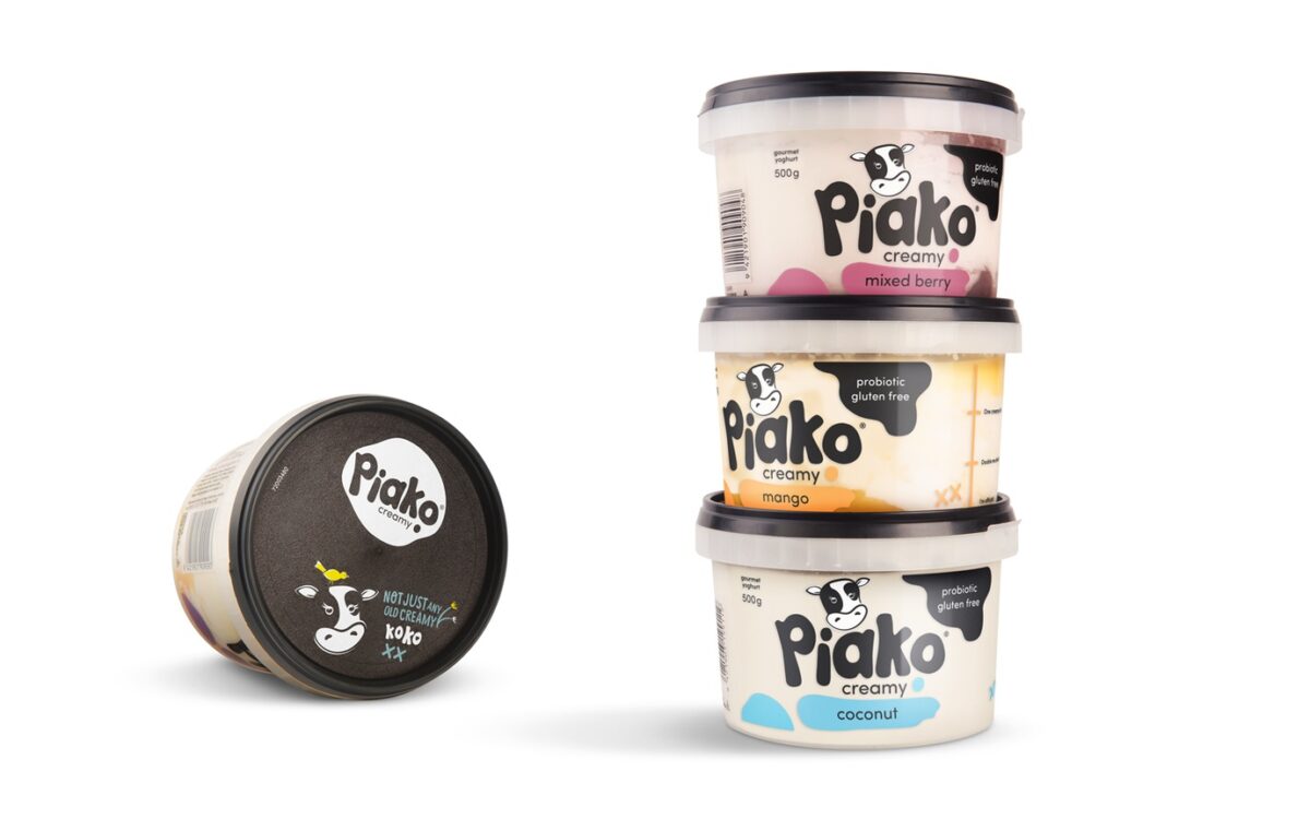
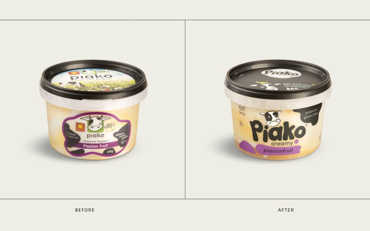
Results: Put Piako back into growth & increased market volume share by 4%, with no additional advertising or promotional support.

New Zealand’s under-the-radar, but preeminent coffee roaster.

The new Robert Harris fresh coffee packs we designed last year are hitting supermarket shelves now and we are hyped to see them. Now in a new flat matte finish the big change is the way Robert Harris’ range is clearly defined by coffee-making method.

One of the amazing things about Robert Harris – New Zealand’s under-the-radar, but preeminent coffee roaster – is that they have actually tailor-made all their blends for the coffee equipment us average Kiwi Joes have at home. So a plunger grind blend is deliberately more complex in flavours because plungers allow the subtleties of a coffee’s taste profile to come through. Conversley an espresso grind needs a bit more grunt in its bean blend to survive the hammering through the machine.

It’s a bit of a radical shift for a category that, frankly, befuddles a lot of us when it comes to choosing a good coffee off the shelf. Luckily Robert Harris’ master roaster, Scott Pepler, knows a hell of lot more about it than us. And now that know-how is ours for the tasting.

316b2ee9a479fd81d86b72f80d60d515

Special Reserve Christmas crowned Champion Cheese.

Not only did the Mainland Special Reserve promotional Christmas packaging lift sales by 16% over the key Christmas period, it has also been crowned the Champion of Cheese Packaging at the annual New Zealand Champion of Cheese Awards.

That is a fantastic result for Fonterra Brands who have enjoyed consistent success at the New Zealand Champion of Cheese Awards with their Mainland and Kapiti brands.

It is encouraging to once again see just how powerful the pack can be, even if only for promotional periods.  This Mainland success story is a great example of how packaging can be used as a billboard to promote a fresh message, drive sales growth and bring new users into a brand.

We congratulate Fonterra Brands and their fabulous cheese team for the continuous stream of award winning and sales driving innovations.  Yes ‘Good Things Take Time’, but sometimes they also just take a bit of savvy thinking.

We speak with Rebecca, traveller, list-maker, boot camper & compulsive cleaner.

As a part of the small but infallible Dow client service team you have a lot on your plate. Do you have any rituals you use to help keep the pace?

I’m a big list maker (both at home and at work) and have several lists on the go relating to different tasks and goals. Every Friday I write a list for Monday morning so that I can start the week knowing what needs to be accomplished first. Kikki K (designer stationary company) make some brilliant daily planner notepads. I’m a real fan of cool stationery. I also use a few organisation apps like Any.do which help to prioritise tasks and integrate with my calendar.

I usually start the day with a run, bootcamp or swim to wake myself up… that or a coffee. I was an avid tea drinker when I lived in England, and am still very partial to tea, but since moving to NZ I drink a lot more coffee; probably because your coffee is so much better.

You hail from the northern hemisphere, what brought you down to little old New Zealand, and why is it that it’s just so much better?

The short version of the story is that my partner is a kiwi and so I moved here to live with him. The longer version involves six months backpacking around South East Asia, an unexpected meeting whilst travelling in New Zealand, a holiday in Spain, 9 months of umming and ahhing and then a decision on New Years Eve a few years ago to jump on a plane.

New Zealand is a truly special place. It’s beautiful, that goes without saying, but it’s also a place of vibrant opportunity. It’s remoteness, which can be challenging, especially for someone like myself whose family and friends are largely on the other side of the planet, is also what makes it so unique. The no. 8 wire attitude, ingenuity and creativity that abound here make it a remarkable place to live. I love it. And as I mentioned previously, you have better coffee.

Rumour has it that you have a bit an arty-farty background. Tell us a bit about your previous experience in the art world?

Well, I have a degree in Fine Art, a Post-Grad Certificate and a Masters in Art Education, as well as teaching Art and Photography for 3 years, so yes… bit of an arty background! I have always loved Art and Design and still do some of my own stuff when I find the time, although usually it’s just making work for friends and family rather than exhibitions now.

To be honest, I just enjoy creative problem solving and ideas generation in general, (I’m a member of Mensa, and they send out monthly webzine full of puzzles… I love it. I’m a bit of a geek at heart) and what’s nice about working at Dow is that it allows me to be involved in the creative process as well as the project management, client relationship, marketing and brand strategy that I also love.

What do you do to cut loose?

I’m probably happiest outside, so I like running, fishing and hiking. I also like trying new stuff, and like having a go at new hobbies. I tried windsurfing recently… I’m terrible at it, but it was fun. I rarely stick with these things (I’m so fickle) but I like to try them out, and will give most things a go once, whether it’s sky diving, kite surfing or flying a helicopter! One that I have stuck with was diving. I don’t get to do it as much as I’d like, but am off to Poor Knights this weekend for an explore.

If I can’t get outside, then I love cooking and watching Netflix, usually with a glass of red wine. I also do yoga, but I’m not great at meditating. My brain is quite active and I find it hard to switch off. Cleaning actually helps with that, and I like the house to be tidy, so that’s kind of meditative for me.

That damned technology be everywhere, some of it has been fundamentally life changing and some not so much. If you had a spare 5 minutes to design and create a new app, what would it be?

My partner’s company actually build a lot of apps and web tools, so we talk about ideas for apps a lot!

I think the best apps are those that make an existing process more efficient; Uber, for example. There will always be a need for taxi’s (until self-driving cars become common… don’t laugh. It’s only a matter of time!) and Uber just makes the process easier – cashless; integrated with locational data on your phone; clear and intuitive user interface… It’s brilliant. We were in Paris in January and it removed any language barrier issues because you book your trip and pay for it through the app.

If I was coming up with an app idea I’d probably be linking it to one of our client projects. We often have great ideas for apps that could be used for brand launches and comms integration, and it would be brilliant to work on bringing one of those to life.

Overall Supreme Winner

A great opportunity for Auckland’s businesses to measure and benchmark themselves, the Westpac Auckland Business Awards are presented by the Auckland Chamber of Commerce and ATEED.  The awards celebrate excellence in business across a number of categories from Innovation through to Service Delivery.   So for Milmeq to emerge as the Overall Supreme Winner amongst so many outstanding businesses is a fantastic achievement.

We're thrilled to be pulling the cap off the new Mac’s beer rebrand.

Recently released on an unsuspecting public, the new range is rolling out this month into a few select Mac’s Brewbars (the Mac’s Facebook page is the place to discover where). The new packaging has been a fair while in the crafting… As it should be for this iconic drop.

It’s high time to rediscover the classics among the Mac’s range and to explore a few new heroes. Ever the tease, Lion is not releasing the entire range just yet, but there’s plenty to enjoy in the meantime.

483ad7e38931657bbfd9263dce9ccffe 8dca8d28bcc28a77849bd262a7314c40 B60e93f48b3e9f30646288cf8d417556More to the story, coming soon.