Dow Design were sought after by the Speight’s team as the design agency with the commercial understanding to design a refreshed and consistent look.
Speight’s has a fiercely loyal fan base across New Zealand, but they hadn’t updated the hero label design in many years, and new products including cider and craft beers had joined the range. Speight’s were looking for new packaging design to ensure the brand moved with the times and retained its market leader position. At the same time, the rest of the Speight’s range needed a more cohesive appearance.
We identified Speight’s core design elements then applied them across the range of six beers and a cider. The result is a stronger more contemporary design for the market leading beer and a range which is instantly recognisable through its packaging design.
Donna McCort is the Creative Director at Dow Design.
What makes Dow Design different from other design agencies?
“There’s a cliché about designers dressed in black polo necks, with black rimmed glasses being terribly precious and elitist about what’s cool. I like to think we’re more in touch with real people, that goes for both clients and consumers, and helps us create effective designs that get results.”
What is the most important information to have as you begin a new brand project?
“Understanding the consumer. If we know what they really think about your brand, product or company, and what matters in their life, it is easier to bridge the gap between where you are and where you want to be as a brand or business.”
Does that change if you’re researching brand and packaging design for export?
“That’s an interesting one. We have designed multiple brands and packaging for international brands, more and more so for the booming Asian markets, and recently an exciting food product launching into Spain, France and Italy. We do enjoy the challenge and it’s fascinating to learn about cultural differences in attitudes, behaviours and languages, the French for instance have a very unique stance on breastfeeding!“
“What we already know is that people everywhere respond to authenticity, reliability and good ideas. If you have a really good product that fulfills a real need, the best thing as a brand is to express your story as honestly and as clearly as you can.”
Do you have a favorite New Zealand brand right now?
“Stolen Rum. I wish I had created that brand, and I wish I was those guys. I like the story of how hard they worked to create something authentic with a unique spin on it. The product has a striking flavour and I think the name and the identity are clever clever clever. Love it.”
Where do you get your insights on brand design?
“I like to just let life in, more than hunting specifically for things labelled ‘brand design’. I think there is so much to learn from seeing all of the stuff that surrounds us. Sometimes the stuff that is not consciously ‘branded’ is all the more powerful at connecting with people.”
“For instance those signs people take photos of and send in to Sideswipe [column of the New Zealand Herald newspaper]. It’s interesting to see what gets people’s attention. I love words and humour.”
What do you do to maintain your creative edge?
“I have a very large wardrobe!”
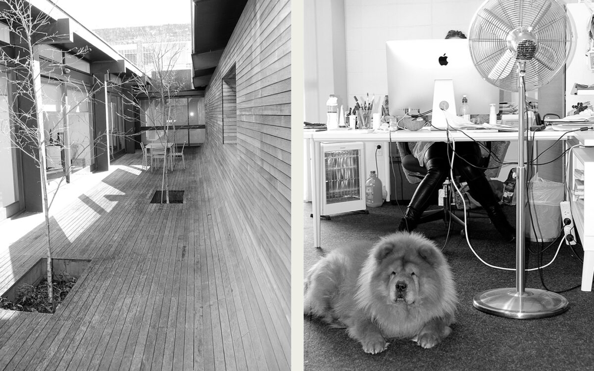
Tell us about Floyd
“Floyd is the main man in my life. He’s a rock star. This can be a little tedious when you’re out with him because he gets mobbed and people want to take his picture all the time. But he is desperately handsome. Also big and hairy. That’s my preference in guys.”
Last year we had a great time working with Cookie Time
On this project we employed the help of a world renowned Italian illustrator to give the furry fellow a few lifelike expressions on the brand elements, and she did an excellent job. Cookie Time is one of New Zealand’s favourite snack food brands, they’ve just celebrated their 30th birthday, and announced they’re going to be exporting internationally. So if you’re one of our international fans, look out for a Cookie Time cookie near you.
Always great to see our brand and packaging designs helping businesses to grow.
As Sure as Hellers!
Hellers latest television commercial, introducing Hellers Cocktails, a range of gluten free cocktail sausages, a quintessential kiwi fave. Featuring packaging design and characters created by Dow Design, with TVC animation produced by our friends at Waxeye.
Dow Design have been integral in developing brand and packaging design for Hellers, a NZ commercial success story.
Dow Design’s packaging design has received acclaim from the Summit International Awards.
In the announcement we received from SIA:
“With more than 5000 submissions from 25 countries, your creative scored among the very best."
Your winning entries are:
• Award: Silver Category: Packaging Series
Entry: “MitoQ” Client: MitoQ
• Award: Bronze Category: Packaging Series
Entry: “Robert Harris Coffee” Client: Cerebos Gregg’s
Over the past 19 years, the Summit International Awards organization (SIA) has established itself as one of the premier arbiters of creative excellence.”
The Summit International Awards (SIA) organization was founded in 1994. The organization conducts the Summit Creative Award, the Summit Marketing Effectiveness Award and the Summit Emerging Media Award. The 2012 competition is the 18th year for the creative competition. Additional information about the Summit International Awards organization, its competitions and winning firms can be found on the Summit Awards web site at www.summitawards.com.
The beauty renegades
Greg MacPherson is MitoQ's CEO and chief of marketing, and a qualified pharmacist. Some indication of how MitoQ continually values real, world-leading science as its core point of difference. We posed Greg some questions on how MitoQ has fared in the highly competitive cosmeceutical market since we worked with them two years ago.
What have been some of the challenges launching a new brand to the world from a base in the South Pacific?
Learning that brands with massive marketing budgets trump brands with incredible science and products that work.
Designing the stories about our science in a way that is responsible, easy to understand and not hyped but still compelling enough for a BUY NOW click.
Filtering the noise - there are so many experts in the world.
MitoQ has quite a story to tell, what were the most successful channels for getting your product story across and winning loyal customers?
MitoQ has an amazing back story and a continually evolving one. Our most successful progress to date have not been from traditional marketing activity but from news outlets picking up some of the more recent research that has been undertaken on MitoQ in universities and laboratories around the world.
That is independent validation of our product by independent researchers and published in independent media outlets. The success here is driven by real science with integrity and it's very a clear indication of the fatigue that consumers have about the words and content that are pedalled in certain circles of the supplement and cosmetic industry.
How has your sales and marketing focus evolved?
We went out to conquer the world and it became very evident very quickly that specific markets were more open to our products than others. We have failed fast, learnt quickly and found the low hanging fruit. Our focus is now very much on those markets where our time is best spent. That is not to say that we won’t circle back and tackle the tough markets later but right now, as we are establishing and building relationships with our customers, its all about putting our energy where direct sales result.
How easy or hard did you find it to get a unique voice in the competitive cosmeceuticals and anti-aging arena?
Extremely difficult. We have an amazing product, we have over a decade of research, we have global patents and yet finding a tone of voice or words that have not been used 100 times before us has been a real challenge. Have we got it right yet - probably not. Will we get it right - yes.
What role does design play for you in the business?
Design is core to MitoQ’s values. Our core ingredient was the result of design at the molecular level. From day one we have invested in design. Form, function, customer experience, logistics, packaging, labelling, communications, … I think you only need to look at the success of design lead companies and the value they create to see that design should be factored into every level of your business.
From time to time we have commissioned independent research where we seek insight into changes in marketing and business, looking to identify challenges, trends and innovations that will influence our future.
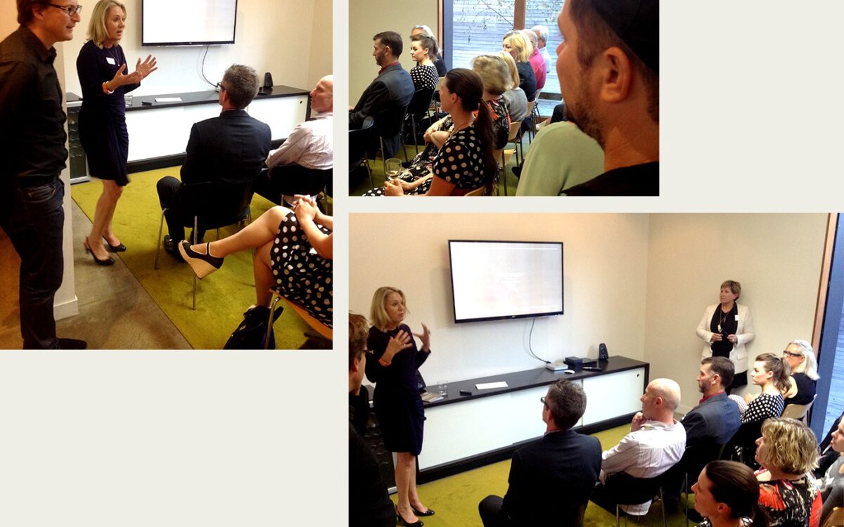
Following research which completed earlier this year we’ve produced our Marketers’ World Insights booklet.
In carrying out the research our consultants spoke to leading marketers (many of whom are our existing clients), industry observers and influencers in the latter part of 2013. In this video produced for a series of presentations are some of the ideas and trends our peers and clients are grappling with.
The significant shifts that have occurred since our last market review have been fascinating. There is no question that we have all found the shifts challenging, but we are also seeing opportunities in a new golden era for businesses that places customers at the centre.
— Annie Dow, Managing Director
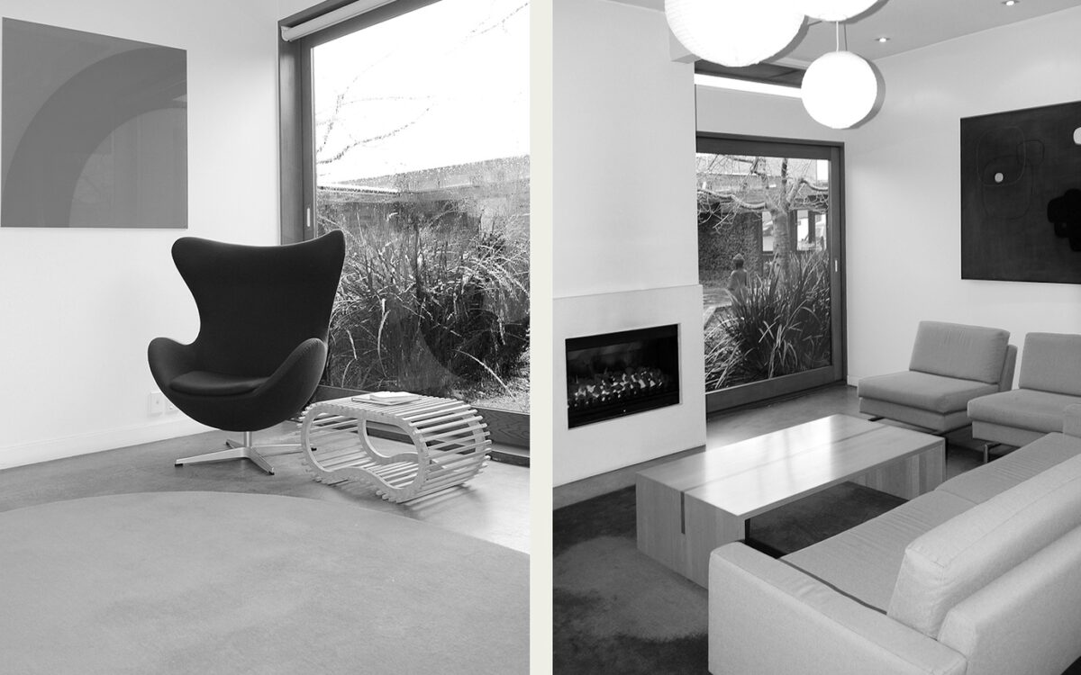
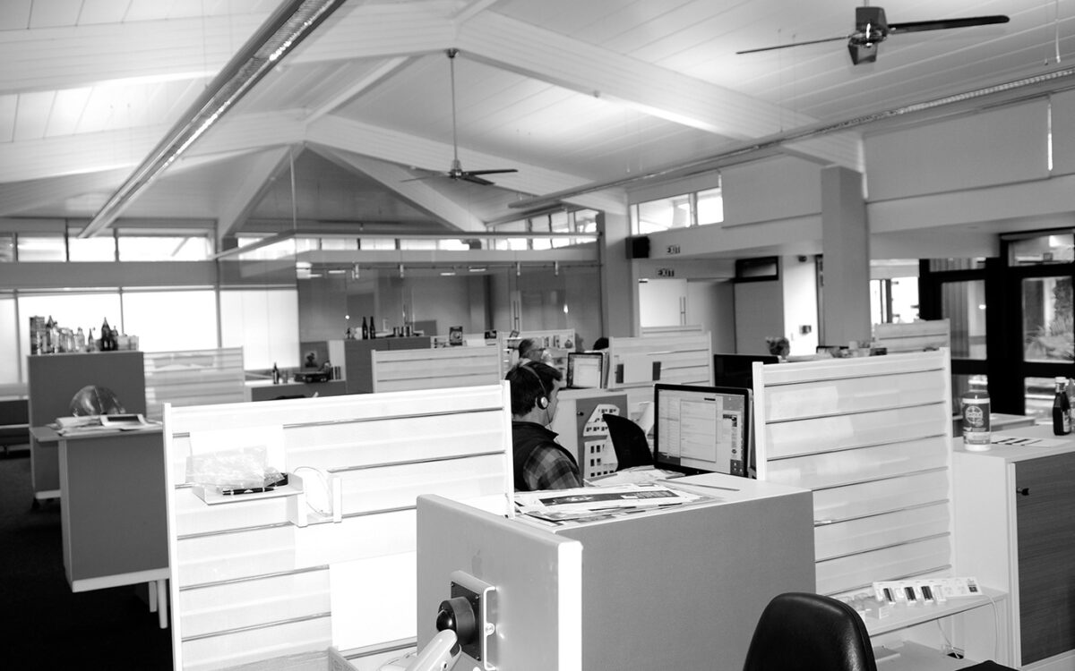
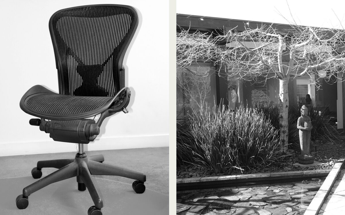
Just off K Road, near the little coffee place, next to the Citroen mechanic.
We love our fireplace, courtyard, funky pivoting front door and the overall architecture of our building.
The history of our space?
Well, it was previously built in the 60's as a social centre for the elderly, a place to gather and meet, it then became the infamous Elim Church. We renovated in 2001 and kept the bones of the unusual-shaped precinct-style building, while making it more architecturally interesting and workable.
What's a typical day like?
Generally 9AM – 6PM. Extra hours when all hands to the pump is necessary.
What's our music policy?
Everything goes. Shared music server, shared DJ'ing. Those who aren't into it, headphones provided.
Fashion police?
Nah, we're pretty relaxed. You can be quirky, or power dress.
What other designers, artists or studios interest us?
Most of our creatives would have a bank of different designers that they admire, a lot would be international. Pearlfisher always springs to mind. Dow Design has been likened to Wallace Church, New York, as a similar close-knit team. I personally have always been inspired by the work Wolff Olins create. Locally one would have to admire our competitors, always a healthy approach. — Annie Dow
Studio rituals?
Birthday cake on birthdays — we love cake.
Brands are often the most valuable asset of a company. Think Coca-Cola, Apple, Fonterra.
This is the world in which the Dow Design Group operates and excels. “For us,” says Annie Dow, “ ‘brand’ represents the very essence of a company and it’s why we strive for creating strategic awareness for our clients – the ability to articulate to the consumer what it is that makes their product better than that of the competition.’
“So we are especially heartened to see that the The Dieline’s upcoming Package Design Conference in San Francisco (June 23-26) will be focusing on the critical premise that brand strategies are now being built ‘from the package outward’.”
The blurb for The Dieline conference makes this point very strongly. It says ‘In a major shift, brand expression is centering in the package design, “architecting” all brand touch points, and that successful brand managers and designers understand the value of starting with the packaging first.’
“This is music to my ears as it’s the very reason for Dow’s existence. It is the way we have always and will always approach every assignment.”