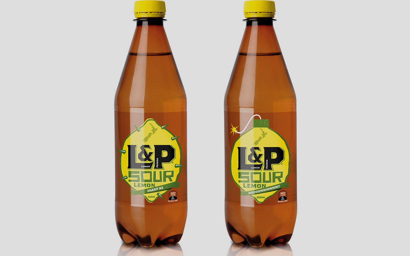
Explosive design for L&P

Booooommm!
The packaging design inspired Saatchi’s edgy and eye-catching street poster campaign as L&P continues to engage with the younger consumer.
This L&P Sour Lemon project continues our relationship with L&P. Last year we designed an updated look for New Zealand’s iconic L&P, helping reposition it from laid back Kiwiana, to refreshing and contemporary kiwi icon (see left). The new design and associated campaign have proved very successful and sales have flourished.
For the new L&P Sour Lemon, a limited-release product designed to further drive awareness of L&P, our designers were unleashed and really got their creative juices flowing. We researched and selected the colour synonymous with sour, green! And to communicate the sour “kick” you get from drinking it, created the images of a lemon grenade and spikey-metal pierced lemon, images which say it all and more!
The street poster campaign to promote the limited release product, features our hero lemon wearing various “masks” as a playful campaign developed by L&P’s ad agency, Saatchi and Saatchi.
Like the catchphrase says, it’s a “Bit different aye?”