The biggest brand blunders of 2016

Time to reflect
With a new year upon us, it is time to reflect on the water that has passed under the bridge through 2016.
It’s not just the water in which we’re interested, but also the flotsam and jetsam of failed branding efforts. Some have delivered the Midas touch in reverse and achieved, if not the exact opposite of what was intended, then certainly pretty close to it. If there’s an upside, it is that we can learn as much from mistakes as successes - so keep an eye out for what can be learned from our list of the biggest brand fails of 2016.
Brands being what brands are – and fails being what fails are – the list is by no means exhaustive. But now... to the list!
The flag
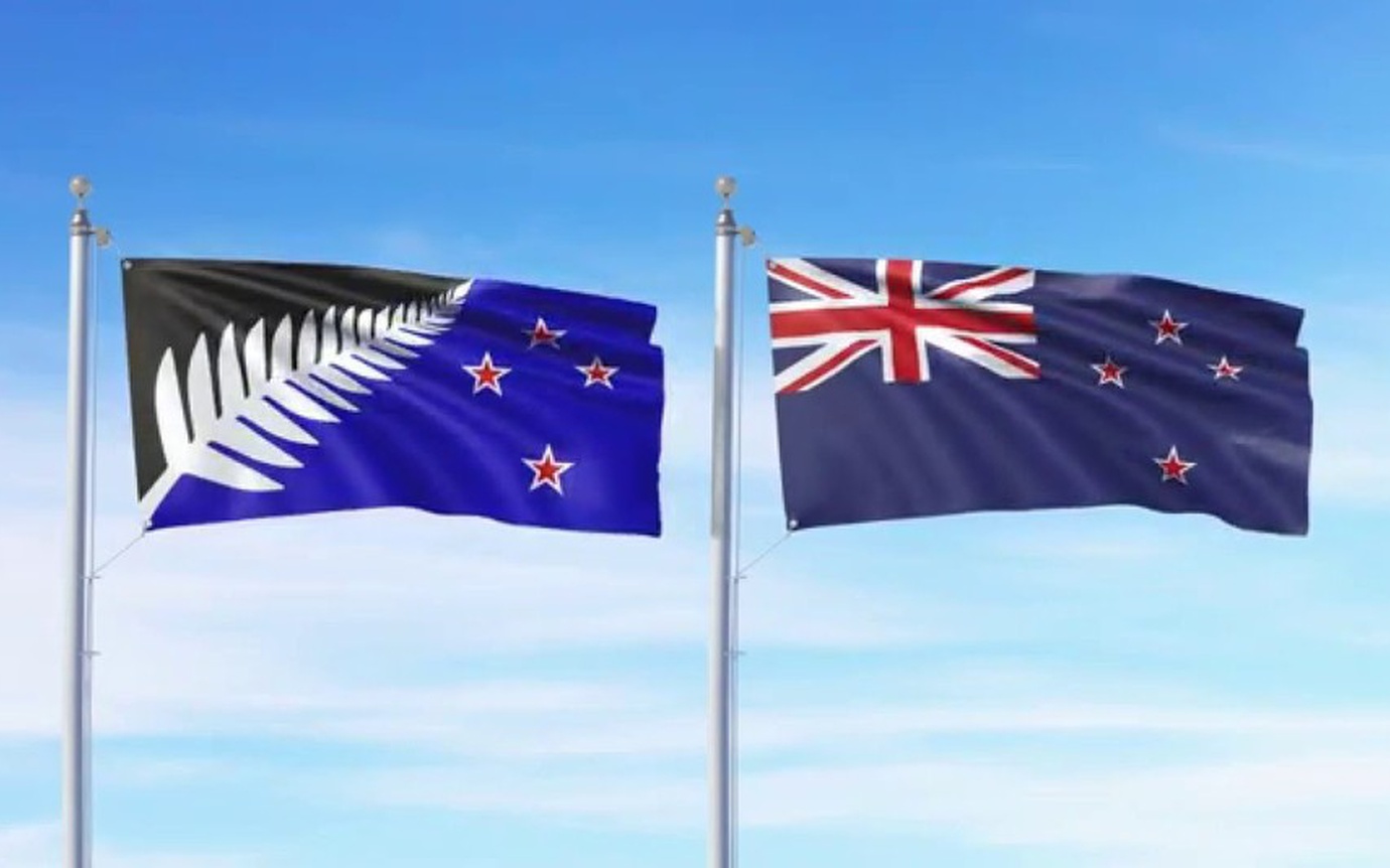
Was a referendum costing $22-odd million and a host of designs really necessary to affirm New Zealanders’ support for the Blue Ensign replete with Union Jack and four red stars? Probably. But things started down the road to ‘pear shape’ by crowdsourcing a bunch of second rate options, with the result that many people defaulted to the existing because the alternatives were Just. So. Bad. The amateur hour process meant 57 per cent voted to keep the status quo. Bye bye silver fern flag, that’s a brand fail for you.
NZRU & The Chiefs (& Losi Filipo)
Where to start with this one. Repeated indiscretions ranging from the most salacious to the violent and despicable. None of that does a lot of good for your brand, particularly when it inspires headlines like this one from blogger Te Reo Putake: ‘NZ, the home of rugby, raping and beer’. With that state of play, probably would have been a better approach to look penitent as quickly as possible. Instead of mixed messages and crossed communication lines. A good picture painted, it ain’t (although we suspect the best efforts probably stayed behind the scenes).
Local election billboards
Local elections are notable for the almost complete lack of interest they inspire in the electorates. It’s not terribly hard to imagine why that is, with one smiling visage on any given billboard almost indistinguishable from any other. Who ARE these people? And why are their brands so anaemic? Given that we’re moving into an election year in 2017, let’s pray to the collective gods that political advertising gets a whole lot better.
US Democrats & Hillary Clinton
Yes, just about all that could be uttered about the US election has been said. But we’re going to go out and note that grey, middle of the road, beige and bland, does nothing as a brand. Nice is nothing more than a polite noise. Bill is nice. Don’t be like Bill. Don't try to please everyone, and please, get a better slogan. Too late for that memo.
Samsung Galaxy Note 7
What could be a worse brand blunder than having every airport in the country broadcasting the inflammatory nature of your product? Particularly if that product isn’t a firelighter, but in this case a ‘not so’ smartphone. Poor Samsung and its Galaxy Note 7. Getting all the attention for all the wrong reasons and likely lingering on in the hearts and minds of air travelers thanks to an update over the PA system four times an hour. Long after the device itself has disappeared, too.
Microsoft’s AI Twitter Bot
Artificial intelligence and machine learning are changing the world as the ability to mimic human thought edges ever closer to reality. Some aspects don’t warrant mimicry, though. Microsoft, fresh from a mini-scandal over a misplaced joke from CEO Satya Nadella, got a big serve of bad brand pie by releasing a racist and misogynistic AI Twitter bot which turned out to have antisocial characteristics. What a piece of work is man, indeed. 24 hours and it was goneburgers.
Rhode Island or Reykjavik?
Scholars of geography and those who enjoy a spot of travel will recognise that one is the capital of Iceland, the other is the smallest state of the United ones (outside of DC). When putting together a promo video for Rhode Island, probably a good idea to note that it isn’t an island. Oh, and also, that it isn’t Reykjavik, so don’t include footage from Iceland. Yes, that happened and they had to can the campaign. Expensive fail.
‘The place desired by many’
Yep, we’ve saved the best for last and it is also hyperlocal. Why wouldn’t you want to be in ‘The place desired by many’? Probably because it just isn’t most. Daft as slogans go, this one takes the biscuit for being lackadaisical at best. While funny-because-its-so-bad, less amusing is that the Auckland Council threw half a million dollars at what we can only describe as an EPIC brand fail.
So, what do we learn from all this? As in life, so it is in branding…don’t be beige, be relevant, be authentic, and most important of all, strive for great rather than settling for good.