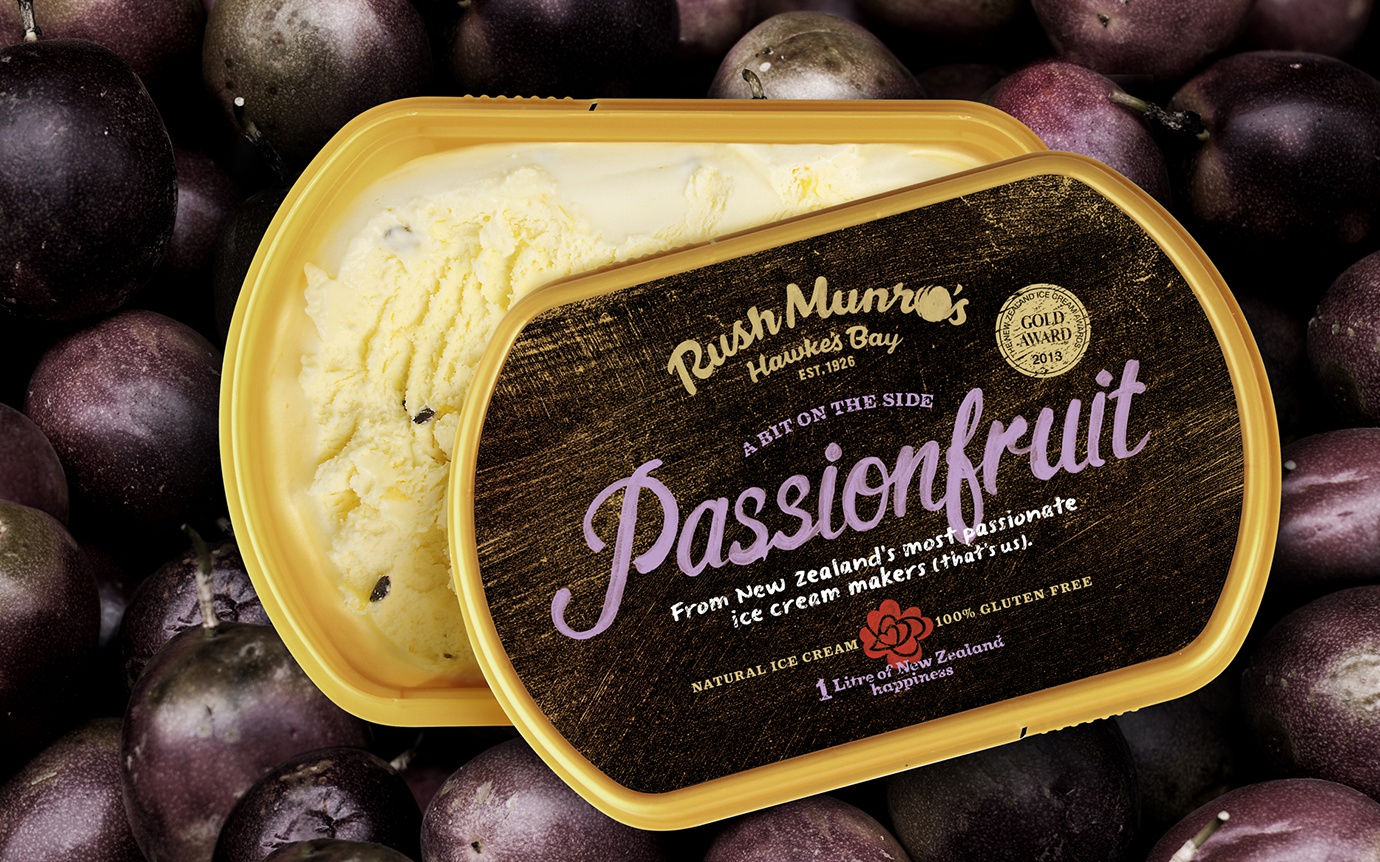
Design for Rush Munro’s comes naturally

In this age when brand integrity is king, Rush Munro’s Ice Cream has honest heritage and natural integrity in spades, or should that be scoops?
Rush Munro’s ice cream company was started in the Hawkes Bay, back in 1926 and today the ingredients and methods of manufacture have barely changed at all. Their all natural ice cream is still handmade, using locally sourced ingredients wherever possible.
With the owners looking to lift the profile, they wanted to ensure they had a strong brand foundation to drive their marketing. Having identified that premium ice cream packaging was extremely competitive, we noted most essentially said the same things in the same colours; “New Zealand”, “natural” and “premium”. So we set out to create unique and authentic packaging that was true to the Rush Munro history.
Dow Senior Designer Tony Masterantonio visited Rush Munro’s production team and the company’s historic Ice Cream Gardens in Hastings, discovering all about their history and traditions. Driving around the Hawkes Bay, Tony was inspired by rustic hand-painted and chalkboard signs outside the orchards which supply ingredients for the ice cream and this was the starting point for the design.
New brand and packaging design will help Rush Munro’s to stand out and send a strong message of New Zealand made history and honest small business integrity.
For more details check out the article on NBR—Rebrand opens Foodstuffs' freezers